This article is part of our body language guide. Click here for more.
Studies show you only have 0.05 seconds1https://www.tandfonline.com/doi/abs/10.1080/01449290500330448#.U0WP9K1dVQ8%20 to make a great first impression online. Take a look at the following split-second image and see what opinions you make:

You need to capture your online audience’s attention by really nailing down your advertising psychology. In this guide, I’m going to show you:
- how to use nonverbal cues to increase your income, influence, and impact
- how to use emotion in advertising to sway opinion
- why happy faces and babies win over viewers
- how companies like Volvo, Rolex, and Vaseline know exactly how to hook you in
But first, can you recognize the signs?

Can You Read Body Language?
How good are your body language skills? Take our free body language quiz to find out!
Emotion Works
Back in 2007, it was estimated that the average person views 5,000 ads per day. Fast-forward to 2021, and it’s now estimated people see 6,000 to 10,0002https://lunio.ai/blog/strategy/how-many-ads-do-we-see-a-day/ ads a day. That’s up to 7 ads per minute.
So which ads are the most effective?
In 1,400 case studies of successful advertising campaigns, Fast Company3https://www.fastcompany.com/3027699/how-our-brains-decide-what-we-share-online found that emotional content performed almost twice as well as rational content (31% vs. 16%). And purely emotional ads were even better than ads that had a mix of emotional/rational content.
Emotional appeals work because our brains release specific neurotransmitters that flood our bodies with feels. Whether they’re good or bad depends on what we hear or see.
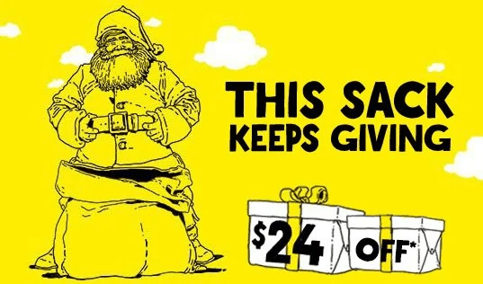
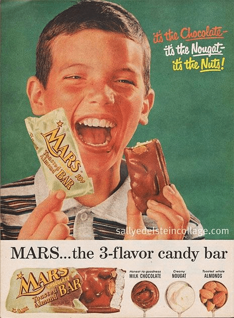
Take a look at the following ad, for example. What kind of emotions stir up in you?
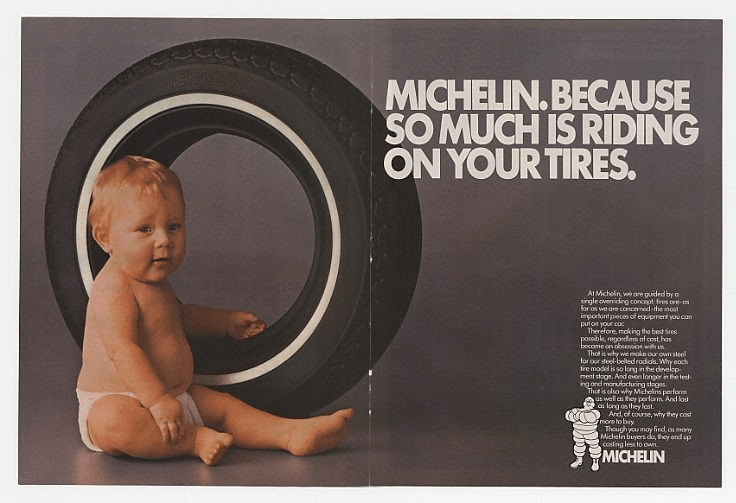
If you’re a parent, like me, then you’re swayed by this ad because it promotes protective, parental feelings. Logic sells the brain, but emotions sell the heart.
So if you’re aiming to make killer ads, make sure to add a bit of emotion to be effective.
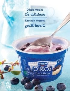
Happy vs. Sad
When we think of happiness, we usually picture someone smiling. Research shows people think smiling would work better when promoting toilet articles, amusements, and food4https://www.amazon.com/Nonverbal-Communication-Human-Interaction-Knapp/dp/1133311598. And it makes sense, because who would be sad eating the most delicious food ever?
On the other hand, people think unsmiling actors would be better suited to sell clothing4https://www.amazon.com/Nonverbal-Communication-Human-Interaction-Knapp/dp/1133311598. And if you’ve walked in a mall recently or browsed social media, you might have even noticed this yourself.
This gives the feeling of power and determination. Sad advertisements tug at our hearts.
Using happiness and sadness is perfect for those who:
- use models in their advertisements
- want to promote straightforward feelings
- have a cheerful or determined brand voice
Fear and Anger
In one study5https://www.researchgate.net/publication/37689381_Campaigning_for_Hearts_and_Minds_How_Emotional_Appeals_in_Political_Ads_Work, black-and-white images were ten times more likely to signal an appeal to fear or anger than one to enthusiasm or pride. In these advertisements, you can often see high contrasts that subliminally signal a “you” vs. “them” mentality.
Using fear and anger is perfect for those who:
- want to stop the use of a product or habit
- are trying to promote long-term change
- are making a political statement or have a clearly defined competitor
Humor
Being funny is one of the best ways to connect with people. Plus, it makes companies memorable. If you want to stand out from your competitors, try implementing humor.
However, keep in mind you might risk alienating some of your audience depending on the type of humor you use.
Spirit Airlines6https://www.spirit.com/ takes the cake.
Use humor if:
- your brand is lighthearted
- you want to add memorability
The “Wow” Factor
I was browsing YouTube the other day and landed upon an oldie-but-goodie advertisement. Remember that one split scene from Volvo? Yes, that’s the one!
This advertisement makes you mentally scream, “Wow!” and is one of my favorite emotional advertising methods. It’s creative. It’s beautiful. And it’s awe-inspiring.
The “Wow” Factor is perfect for those who are:
- seeking to go viral
- wanting to inspire change
- forward-thinking
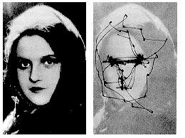
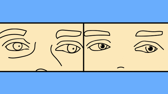
Eyes as Cues
Having a picture like this in your ads or website is a great way to control the gaze direction of your customer. Look at this picture of an eye map. This is where most people look when seeing a picture for the first time. As you can see, we typically look at people’s eyes, so if their eyes are pointed somewhere else, we tend to follow.
But usually in an advertisement, there is a central focus—an action step, like “Click Here,” or a product, and this is where a customer’s attention should ideally be.
So how do you get the customer to look? Have someone in the advertisement looking at the target. Humans instinctively want to look at what someone else is looking at, so if you have a “Buy Now” button on an advertisement or are selling a shoe in a commercial, you want to have a model looking right at that target or main message. Here is an example:
Your eyes want to follow where his eyes are looking… toward a logo, slogan, or call-to-action.
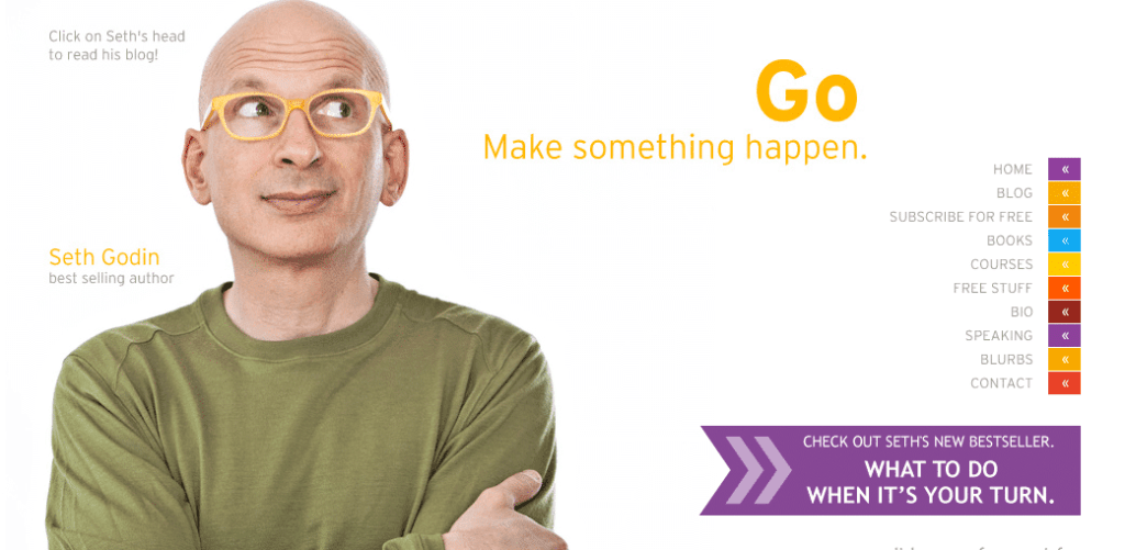
Take a look at how marketing and advertising guru Seth Godin7https://www.sethgodin.com/sg/ uses this principle on his website. He wants you to take action, so he is looking at the sidebar panel with all of the cool areas of his website.
Focus Their Focus
Where are your readers looking? There are certain features on your website where you tend to draw the most attention, but often only one or two are used effectively:
- logo
- main navigation menu
- search box
- social networking links
- primary image (whatever image was at the top of the repeating header or page)
- written content
- website footer
Why is this information essential to home in on? Dr. Hong Sheng at Missouri University led an experiment8https://news.mst.edu/2012/02/eye-tracking_studies_show_firs/ using eye-tracking software on students as they scanned certain websites. She found that people’s eyes are drawn most to those 7 website features, time and time again! As a creator and online marketer, if you’ve found yourself lost on where to focus your efforts, those key features will give you the most success in helping your consumers decide what they think of your website and product.
Additionally, The Poynter Institute also did an eye-tracking study on consumers, but this time they tracked eye behavior as users read web pages. The results of this study indicated that virtual readers’ eyes follow an F-shaped pattern on a website. First glance begins in the upper left-hand side of the page, and then moves across, then down, then across and down again.
To mimic this, think about adding headings and buttons in the F pattern of your website! You want to follow where people’s eyes naturally flow.
Show Your Hands
With each new user exploring your site, your number one priority is to give them a positive first impression and then have them take action. How do you tick both of these boxes in one fell swoop? Hand gestures! Using your hands to gesture or point to where you want people to look or what you want them to do is simple. There are tons of stock images out there that you can use of people looking, gesturing, or pointing in whatever direction you desire.
An image of someone pointing at your product or action button is a great, easy way to start getting more conversions and sales!
In fact, I do this in the quiz up top!
Now, it isn’t all just about pointing. Research has found that our hands are our biggest trust indicators. When people can see our hands, they feel that they can trust us. When you choose your photos for the website, even if they’re not pointing, try picking ones that show your hands as much as possible.
Trust is a huge part of your online first impression. Get off on the right foot, or hand, by showing them (and ultimately, showing that you’re a trustworthy brand).
Uncross Those Arms
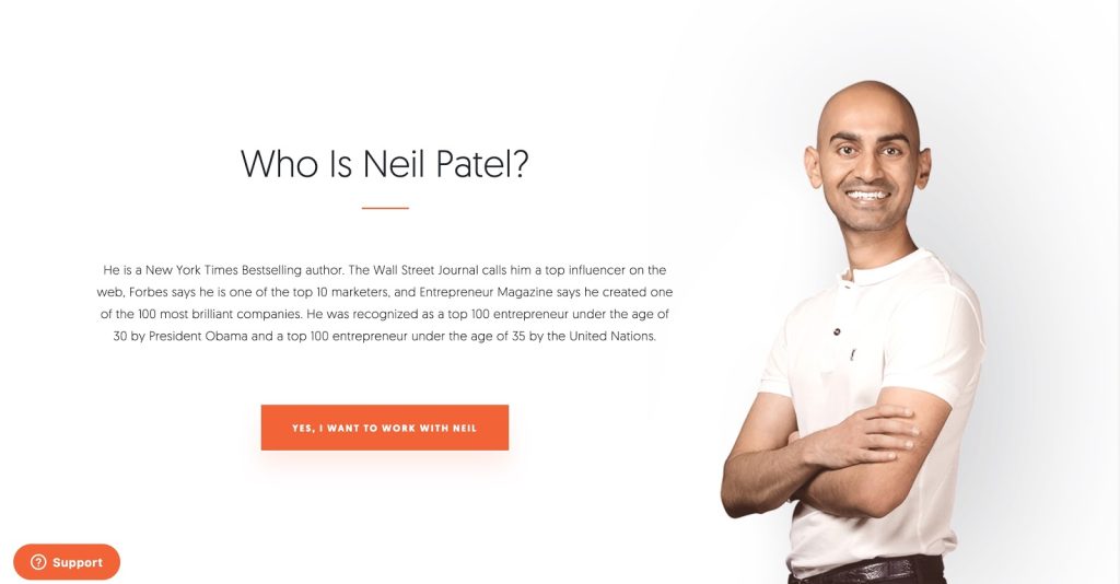
Did you know crossed arms is a natural closed-off body language cue? However, we see it all the time in modern advertisements and media. Check out expert marketer Neil Patel’s9https://neilpatel.com/ website.
People tend to cross their arms when they feel uncomfortable. You’ll even see this when you first meet someone new and they’re not comfortable with you yet. But as the conversation progresses and you become buddy-buddy, you might notice their arms uncrossing. If you think of 2 people hugging, they would not cross arms—their bodies are open and accepting.
The same is true with images. Crossed arms might look cool, but you’re nonverbally signaling “I’m not fully accepting you!” Instead, try relaxing your arms to the side. Or, if you want to give off a feeling of power and action, strike a power pose!

Happy Faces
It’s imperative in online marketing that we understand the seven basic but universal facial expressions. The faces and the photos that you choose to display on your site need to convey the perfect message to your audience.
Unfortunately, one of the biggest mistakes websites make is using photos of people smirking. A smirk, or one-sided mouth raise, is actually the universal signal of contempt or hatred.

Why do we need to know this? We have mirror neurons that encourage us to mimic or mirror the person we are looking at. We do this to feel empathy. When we make a face, we tend to feel the emotion.
This is called the Facial Feedback Hypothesis, where the face you make also makes you feel that emotion. This is why the best face to use in an ad is a happy face!
If we see a confused, frustrated, or contempt-ridden face in an ad, we tend to copy the face, and therefore feel more confused, frustrated, or resentful ourselves. Hopefully, your product or service is solving a pain point, so show the end emotion of success and not the frustrated starting place.
Use Emojis
Speaking of faces, did you know an easy nonverbal trick is to use emojis? Emojis are the digital way of making faces. And they can often convey much more meaning, for example:
“I’m happy!” versus “I’m happy! 😊”
According to a survey by SurveyMonkey, young professionals10https://www.surveymonkey.com/curiosity/is-it-ok-to-use-emojis-at-work-heres-what-the-data-tells-us/ tend to like using emojis:
- “Using emojis in the workplace makes work more fun.”
- ”It makes everything easier.”
- ”Using emojis at work is OK.”
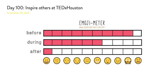
However, older professionals might find this to be inappropriate and unprofessional. I love to use emojis because it fits our brand. If you’re going for a lighthearted, cheery tone, emojis are a great nonverbal cue to use!
My good friend Michelle Poler showcases emojis on her neat infographics on her website. I think they look cute and fit her brand image perfectly:
And there are THOUSANDS of emojis out there. How do you know which ones to use?
Head on over to our ultimate guide on emojis to find out!
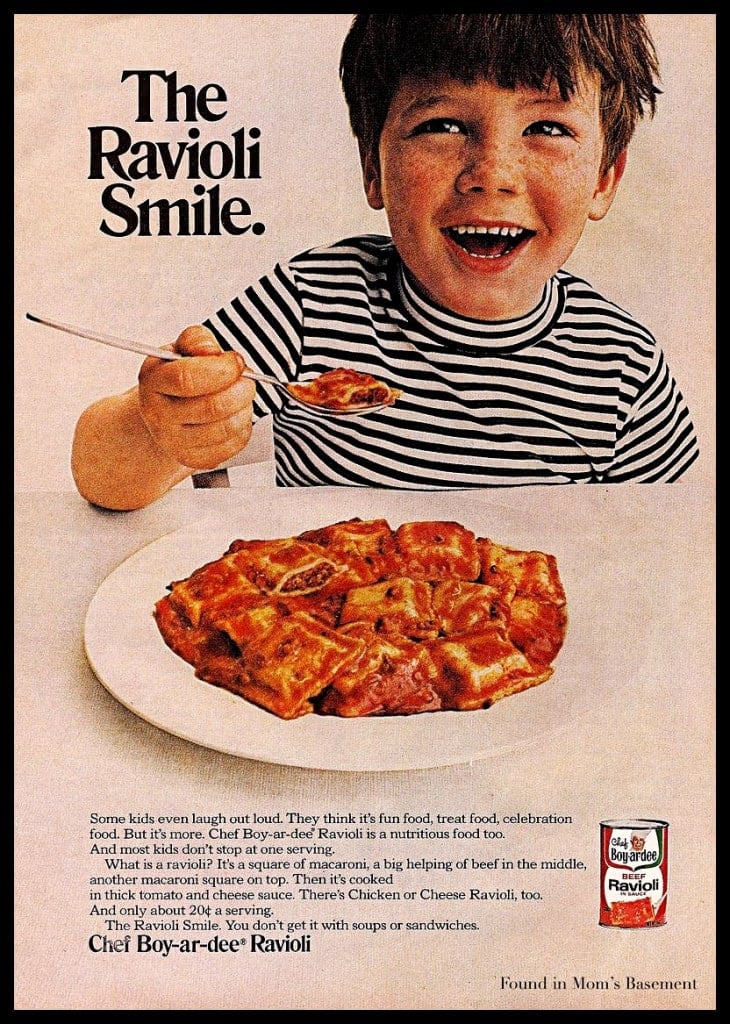
Babies
Our brains love looking at babies. So if your product could have a baby in the ad, include it! See this iconic ad from Cola:
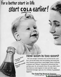
Babies engage a different area of our brains—especially for women. They instantly put us in a warm, caring, compassionate mood. And this, of course, makes us want to buy more.
Dilate Pupils
Back in the 1870s, Charles Darwin found that when we feel fear, our pupils expand to help us take in more of our surroundings. This helps with our fight-or-flight response. When we can see more, we are more likely to survive. Interestingly, our pupils also expand when we see something we like.
In 1965, a psychologist named Eckhard Hess performed an experiment where he showed his research assistant, James Polt, a series of photographs while tracking the diameter of Polt’s pupil size.
When Hess showed Polt a picture of a nude woman, his pupils enlarged immediately.
Further experimentation found that, in fact, our pupils do dilate when we’re aroused—to take in more of the pleasant surroundings.
Additionally, researchers found that people also find faces with dilated pupils more attractive. If you really want to up the attractiveness of your product and your ad, try increasing the pupil size with Photoshop. When you look closely, you will notice most major advertisers already do this.
Take a look at the following photographs, for example. Which looks more appealing to you?
Use Color Psychology
Research has found that colors can greatly affect our moods and perceptions. No surprise here, but another amazing study11https://scholarsmine.mst.edu/masters_theses/5128/ out of Missouri University has found that color has a large effect on how much consumers like or trust a website.
This is HUGE! Your nonverbal brand needs to match your mission and your products. What can you give? What are you trying to sell? How are you trying to change someone’s life?
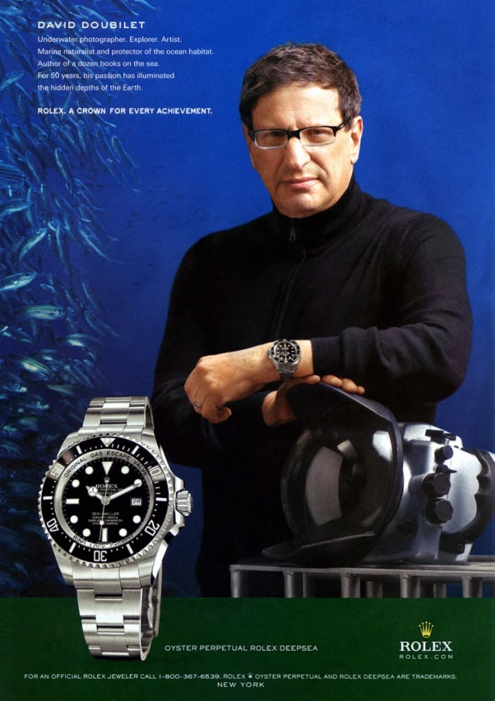
For example, Rolex uses a lot of black clothing on their models. This appeals to wealthy men who love feeling powerful and dominant. You might also notice they aren’t smiling—this gives an extra boost to power.
Buffer’s own Leo Widrich has crafted an incredible post on the science of color psychology and what each color represents when used for online branding. Here are some examples for you to take away:
- Blue: loyalty, stability, tranquility
- Yellow: happiness, optimism, youth
- Green: healing, success, hope
- Black: power, mystery, professionalism
- White: purity, cleanliness, innocence
- Red: passion, sexuality, intensity
- Purple: royalty, spirituality, luxury
- Orange: energy, fun, warmth
Can’t get enough of color psychology? Check out our Color Psychology 101 guide or this helpful guide to how advertisers can use color psychology12https://storify.com/savemymarr884/marketing-tips-the-psychology-of-color-manipulatio.
Money!
If you use dollar amounts in your advertisements, there are 3 nonverbal ways to increase sales:
- Researchers have found that removing the $ sign in front of numbers helps take the sting off of the price for customers.
- If possible, prime with a higher number before listing your price. For example, there is a reason infomercials always say, “Most products like these cost thousands of dollars; we are only offering this today for 199!” They are priming you to think that thousands is high, so $199 isn’t high comparatively.
- Use the middle effect. If possible, offer 3 different choices. Many advertisements do this. The 3 are priced low, middle, and high. Usually, people will choose the middle option to avoid being cheap but feel good about not spending all their money on the most expensive option.
Position for Readiness
Nonverbally, you want your advertisement to signal “readiness.”
What I mean is that if you have a picture of a food product, you want that product to look like it is easy to pick up and eat. This triggers to the brain that it is about to have a snack—hence increasing cravings.
For example, which ad do you think will perform better?
If you guessed the left one, you would be right. This is called the Visual Depiction Effect. Nonverbally, this signals to a customer that it is ready to buy or eat simply by changing the product’s orientation. Researchers have found that if you orient a product toward a person’s dominant hand in a visual campaign, it increases the imagined product use.
Researchers Ryan Elder and Aradhna Krishna experimented with images of bowls, cups, sandwiches, coffee, and yogurt to test how nonverbal orientation could change purchasing and product desirability. They found that it is best to appeal to the right-hand side (sorry, lefties!).
Remember that the nonverbal messaging in your advertisements can greatly increase your sales and impact. Don’t forget about body language, orientation, and color messaging!
Your Eyes Eat First
This builds upon above with a slight twist. How your food is presented is just as important as how it tastes.
In other words, presentation is everything. In one study, researchers gave brownies to 3 groups of participants. The brownies were exactly the same but presented in different ways:
- Group #1 got the brownie on a nice china dish.
- Group #2 got the brownie on a paper plate.
- Group #3 got the brownie on a napkin.
The researchers then asked participants how much they would pay for each brownie.
- Group #1, who got the brownie on a nice china dish, would have paid $1.27.
- Group #2, who got the brownie on a paper plate, would have paid 76 cents.
- Group #3, who got the brownie on a napkin, would have paid 53 cents.
Take the time to make your food look awesome. This is great for you and your dinner parties. I wasn’t sure how powerful this principle would be until I did it myself. I went to Goodwill and got some beautiful serving platters and vases. I then switched my fruit (normally on the counter or in a plain wooden bowl) into a nice display:

I’ll be darned if that fruit doesn’t disappear much quicker! Instead of ignoring the fruit completely, my husband and I have been gobbling them up.
We also have people over all the time, and I have noticed they are much more likely to grab a tangerine from my glass platter than when it was in the mesh bag it came in sitting on my counter!
Food Hack: Go make all of your healthy food look amazing. Bring out your nice platters, arrange the pears into a flower shape, and put your colorful veggies on display as soon as you open the fridge.
Food Hack: This works really well with names for kids. In one study with campers, Dr. Wansink relabeled V8 juice as “rainforest smoothie” and it was a hit. Making peas, rice, and chicken for your kids tonight? No, you’re not! You’re making Power Peas, Tangy Chicken, and Wild Wacky Rice!
Less is More

White space is good and simplicity is key.
We never want to overload our audience by trying to engage every sense they have at once! A recent Harvard study13https://www.eecs.harvard.edu/~kgajos/papers/2013/reinecke13aesthetics.pdf actually found that as website complexity increased, the less appealing the website became to visitors.
If there are too many colors, fonts, ads, pop-ups, banners, sidebar options, buttons, or more, the more confusing it can be to take in for your visitor, and the more likely they are to leave your brand with a bitter taste in their mouth.
For example, I’d like you to visit and compare The World’s Worst Website14https://www.theworldsworstwebsiteever.com/ with a simple yet effective website like Craile15https://www.craile.com/. As you can see, both websites convey different feelings, but the one that’s more reputable is Craile.
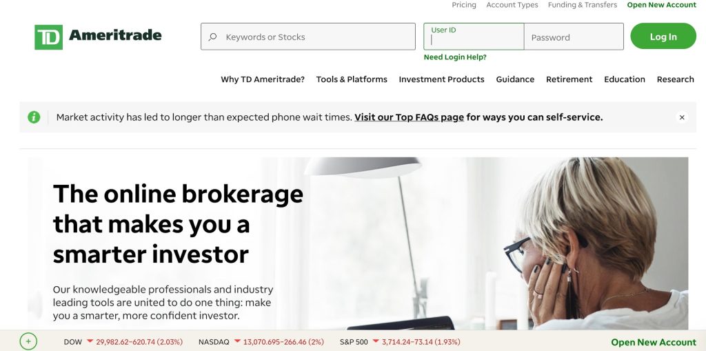
Another important thing to keep in mind when building your website and marketing your brand is that users prefer “prototypical websites,” or ones that fit into their expectations of that category.
For example, creative marketing agency websites shouldn’t look too different from other creative marketing agencies’ sites. Banks don’t stray too far from other banks, et cetera. A prime example is 2 of the largest American investing platforms—Vanguard16https://investor.vanguard.com/corporate-portal and TD Ameritrade17https://www.tdameritrade.com/:

Psychology of Music
Have you ever heard a store’s signature tune? Or heard a catchy song on TV and you immediately knew what it was? I’m imagining this one: “88-88-CC City!”
Music has a huge effect on our brains, and to attract customers, advertisers should employ music strategically.
Volume of Music
There’s a reason why clothing stores aimed at the younger, hip crowd like Hollister and Abercrombie used to blast music. Studies show that a person’s preferred volume of music can change with age:
- People under 50 generally preferred music to be in the foreground (i.e. loud and prominent).
- People over 50 preferred the music to be in the background so they could focus on shopping.
The noise level in Hollister was even tested by The New York Times to hit 88 decibels18https://www.nytimes.com/2012/07/20/nyregion/in-new-york-city-indoor-noise-goes-unabated.html, a volume similar to nightclubs and almost at the limit workers are required to wear ear protection.
Musical Transportation
Oh boy, and don’t even get me started on Christmas music. We also fall victim to a phenomenon I like to call “Musical Transportation.”
Let me explain.
First of all, I feel sorry for those retail workers forced to listen to Jingle Bell Rock 20x a day. And second… playing the right music actually works.
Musical transportation can be explained by a study19https://onlinelibrary.wiley.com/doi/abs/10.1111/1467-954X.00204 that showed that people tend to ‘visualize’ where they would be and what they would be doing with the help of music.
And this might make sense. There are a host of adventure-type audiobooks and things you can listen to that ‘transport’ you somewhere else (I’m a big fan of the Harry Potter audiobooks20https://www.audible.com/series/Harry-Potter-Audiobooks/B0182NWM9I).
So if you’re listening to Christmas music in a retail store, you might be imagining yourself at a nice Christmas party with your friends.
So you do what your subconscious mind tells you and buy all the things!
Another study published by the Association for Consumer Research21https://www.acrwebsite.org/search/view-conference-proceedings.aspx?Id=7467 reinforces the musical transportation phenomenon—when wine shop retailers played either top 40 music or classical music, customers made more expensive purchases when listening to classical.
So what are you aiming for? Calm down customers who wait in long lines with relaxing, slow music. Or ramp up the productivity of workers and even in the office with a productive playlist.
Face or Body
Do you have people on your website or company’s profile? If so, are you showing their face only or their body as well?
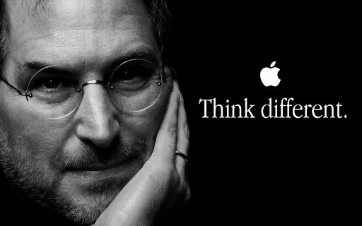
Research shows that magazines and television tend to show more of men’s faces and more of women’s bodies4https://www.amazon.com/Nonverbal-Communication-Human-Interaction-Knapp/dp/1133311598. Body shots are great if you’re promoting health- or fitness-related products.
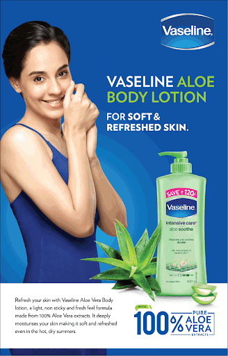
If you’re aiming for something different, try face shots. Photos showing more of the face are seen as more intelligent and dominant4https://www.amazon.com/Nonverbal-Communication-Human-Interaction-Knapp/dp/1133311598. Here’s a perfect example of Steve Jobs:
Incorporate Movement
How ‘fast’ is your website or logo? Effective fast advertising makes us feel ready-for-action and pumped up. Rapid video montages are fast-forwarded or cut:
This makes us feel slow and dull in comparison to the people on-screen4https://www.amazon.com/Nonverbal-Communication-Human-Interaction-Knapp/dp/1133311598. We feel like they are ‘ahead of the game’ or are living faster than us.
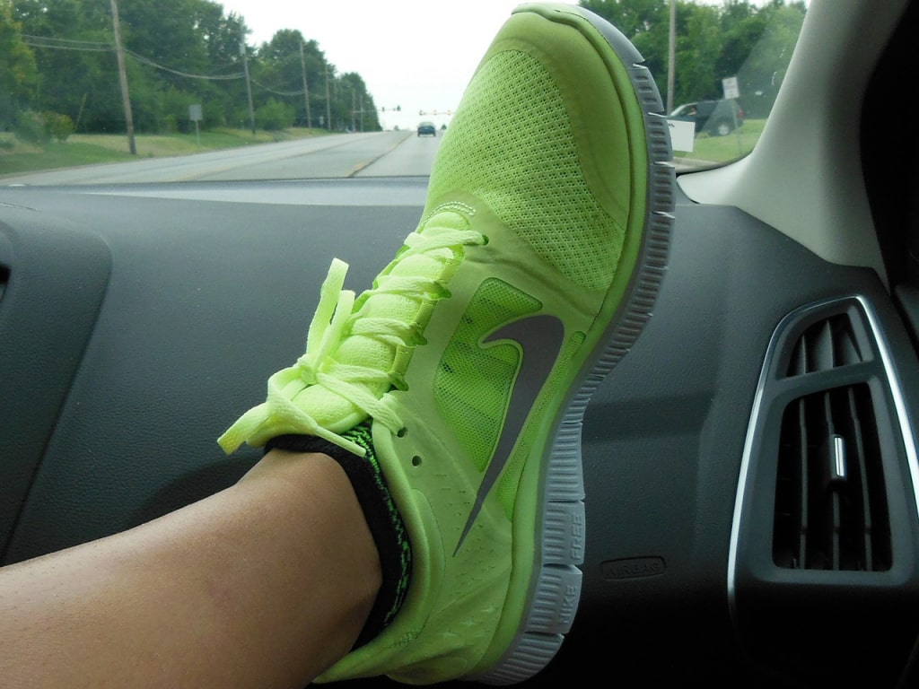
You can also see movement in more common ads.
The Nike Swoosh:
Car advertisements:
Even in the nightclub:
Use movement to get people to take action. You can even use movement to… create a movement! Take a look at Derek Sivers’ TED Talk, where one lone dancer manages to get the entire crowd dancing:
And movement doesn’t have to be fast, either. I was even in the movie theater a couple months back, and after watching Tenet, I saw the complete opposite of fast: People were actually walking backwards!
Talk about effective advertising with movement.
To create movement:
- use slants and tilts in your logo
- incorporate fast-moving lights or text (but still readable)
- use smoke or other effects (I’m a big fan of the movement Feed uses on their website)
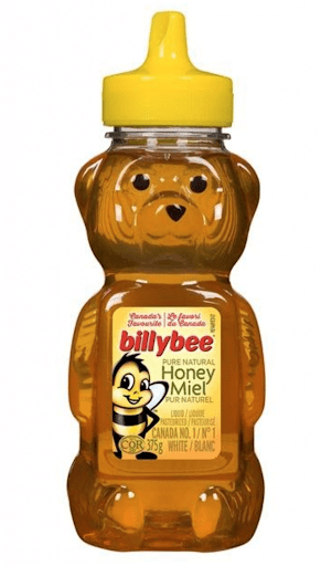
Case Study #1: Manuka Honey
Let’s take an incredible example: Manuka honey. Manuka honey is 8 times more expensive than the typical “honey bear” honey. Why?
There must be some catch. Actually, there is no catch, but there is some clever marketing at play.
Buying First Impressions
Manuka’s marketing is all about the first impression. This is about unique packaging and presentation. With consumer goods, so much of the purchasing decision happens right on the spot. So let’s evaluate what you might think when you first see the different honey brands.
First, the famous honey bear. This product comes in a fun, cute, bear-shaped package. It is simple and fun, and represents what honey is to a lot of people—a sweet treat that they can put on sandwiches, crackers, baked goods, or whatever they like!
The Manuka honey jar, on the other hand, almost doesn’t look like food at all. What do you think it looks like?

It kind of looks like a pill jar, right? It looks scientific. Even the label is plastered with scientific jargon. Then there’s a picture of a flower that makes it look natural, and it’s covered in reassuring phrases like “pure,” “health,” and “100%.”
All of this makes you associate this product not with honey, but with medicine. And guess what: that’s exactly what Manuka wants. Manuka isn’t going for the typical “honey-as-a-sweet-treat” angle (like the honey bear). They’re marketing it as an all-natural cure, and the reason is quite simple: people will pay a lot more for medicine than they will for a treat!
Framing
Framing is a marketing technique where a product’s presentation influences how that product is perceived. Manuka is framing their honey as a cure. Their marketing message is that their honey is beneficial for allergies, acne, and wounds, and they are illustrating that by packaging their honey in a way you would typically associate with medicine.
Framing teaches people how to treat you and your product or service.
Manuka is showing you how they want you to see, treat, and use their product. They have a plan for their product, and they are going after consumers who will respond to that plan. This framing allows them to show people exactly how they are supposed to treat Manuka honey—like medicine that should be savored—and the result is that the consumer is willing to pay more.
Price Anchoring/Placement
Another clever way that Manuka increases their product’s perceived value is with its in-store placement.
Manuka doesn’t put their honey in the condiment section of the grocery store. They don’t want it to be a condiment, because a condiment is a side dish to a bigger meal. Instead, they put it in the “allergy” section, next to all the expensive allergy medications. This achieves what is called price anchoring.
Price anchoring is when you establish a price point for a certain product, which then becomes the consumer’s expectation of what they are willing to pay for that product. Manuka honey may look expensive next to a mustard bottle, but next to allergy medicine, it’s a cheap alternative!
There is simply too much information in a typical grocery store for us to process it all. We don’t know exactly what every product is supposed to cost, so a lot of our decision-making is based on these mini-comparisons for almost everything we buy.
Consumer Behavior
As a result of the techniques I mentioned above, Manuka honey purchasers treat this honey differently. They savor it, and they treat it more as a medicine than a treat. Their behavior shows you exactly how successful Manuka has been in their framing.
They want consumers to think of their product as a medicine, and it works.
Takeaways
How can you use this marketing technique?
Here’s your takeaway:
No matter what you are selling, you need to show people how you want them to treat you or your product. You can use framing in many aspects of your life—in business, in selling, and even in your personal life.
Let’s look at how we can take advantage of this marketing technique in various settings.
In Business
If you’re an entrepreneur, signal to your audience how they should see your product. Draw similarities for them. If you want your customers or clients to treat your product like a comparable brand, then emulate what that brand does.
If you don’t make these comparisons for people, then they’re going to make their own comparisons. Focus on simplifying their choices and using your packaging and your presentation to show them why your product or service demands their consideration.
In Your Personal Life
You can use this technique to solve a problem in your personal and social life too! If you want to be treated well, dress well and show up to events where people you respect show up.
Show people how they should treat you.
If you want that promotion, dress like someone who already has it. Step up your game.
In your personal life, if you want a serious relationship, ditch the bars and nightclubs and go to places like museums, classes, or conferences.
The key benefit here is that you are telling people how to treat you. If you respect yourself, you command that respect in return.
Case Study #2: Almond Breeze vs. Califia Farms
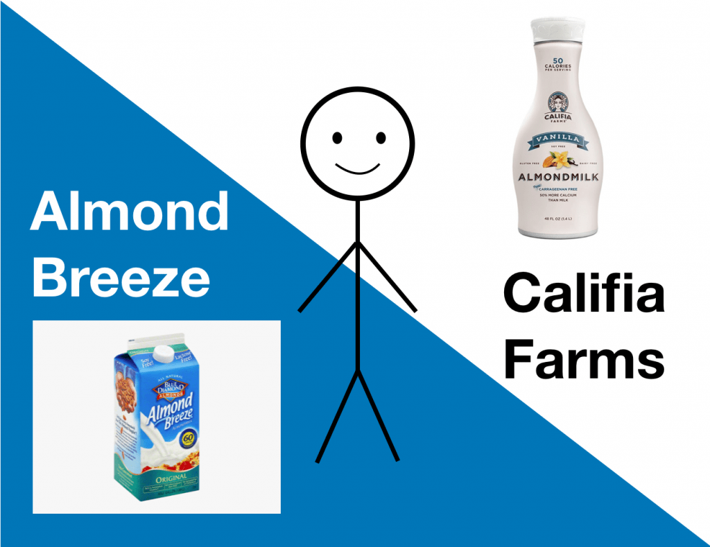
Check out these two types of almond milk. They look pretty different, don’t they? Different packages, different colors, different shapes… but they’re almost exactly the same product!
The reason these two products look so different is that they are going after two different kinds of customer. They are each targeting a different market segment using clever package design. Let’s take a closer look at each to see how they achieve this:
Almond Breeze
At first glance, Almond Breeze looks just like a traditional milk carton. It even has a picture of some almonds “splashing” into some milk. This was a calculated choice.
Almond Breeze is emulating this traditional milk style because they want you to make this association. They are going after customers who are trying to find a replacement for milk. They know that their potential customers simply use almond milk the way that they would use regular milk. Therefore, Almond Breeze wants to simplify their decision by quickly offering them an alternative to milk, in an easily distinguishable package.
Califia Farms
Califia Farms couldn’t look much more different from Almond Breeze. The first thing you might notice is the unique shape. To me, it looks particularly familiar. It looks like the shape of a woman!
This is because Califia Farms is going after the female market. A large segment of women who drink almond milk are doing so to slim down, as it can be a low-calorie alternative to milk.
Califia Farms is communicating this message in a rather direct manner, by literally making their package look like the shape of a woman. On top of this, it is pure, clean, and white, with a prominent picture of a “natural-looking” woman. The calories are even stated right up top, because they know that this is the first thing that their target market will look for.
As you can see, Califia Farms rather explicitly communicates to potential customers that the brand contains everything they are looking for.
Comparing the Two
Almond Breeze is supposed to slot into your life the way milk did, right down to the packaging. It is supposed to fit into your fridge right as milk did, to the point that you barely notice the difference. Califia, on the other hand, is meant for a different purpose, and it communicates that with unique packaging that sends a different message: that it is a natural way to slim down.
So now that we understand the differences, what does this actually mean for you? In the next section, I will explain why these two products represent an actionable message that you can use in your own marketing strategies to attract your ideal customer.
Takeaway: Call to the People You Are Looking For
As a marketer, there is one major takeaway that you can learn from these two brands of almond milk. You need to call out to the people you are looking for.
By “calling out,” I mean you need to clearly communicate to them that you are what they are looking for. Of course, in the split second that they likely make their purchase at a store, this is no easy task.
Therefore, you need to think of how they make that decision and what, exactly, is most important to them in their decision. You need to first know your target customer inside and out, and then decide how you can effectively call out to them.
Almond Breeze calls out as a milk replacement, showing customers it is just like milk. Califia Farms calls out as an all-natural way to slim down. Both brands have created cleverly designed packaging that makes their message clear in the small glance that consumers will give their products while shopping.
How Should I Call Out?
So you have a group in mind that you want to call out to, but how do you actually call out with the right message?
The answer is that it really depends who you are trying to call out to—but there is one key consideration to keep in mind.
This consideration is that the easier you are to spot, the more people you will attract. This is really just common sense, but it is often overlooked. If you stand out on a shelf, or wherever you sell your product, you are going to attract more people.
So try to be bold, use distinct designs and colors, and try to make sure that you really jump off the shelf. Of course, you want to ensure that these features call out to your target person, but by finding a way to stand out, then you are simply going to be discovered by even more people.
Shift Your Perspective
A helpful thought experiment to call out to your perfect customer is to try to get inside their head. What is it that they look for? What do they most want to see in a product? Don’t think about the branding that you like; think about the branding that your perfect customer likes.
It is often helpful to do a comprehensive audience analysis and create a customer avatar that represents your perfect customer. By knowing how they shop, you will know what would make them likely to make a purchasing decision.
Case Study #3: Wildfang
Wildfang is a brand that has taken the fashion world by storm! They keep their message simple—the home for badass women. Their goal is to break all the gender roles that are holding women back.
From a product perspective, Wildfang calls themselves “female Robin Hoods.” They steal fashion trends that have traditionally belonged to men, and they reject the forces that told them they couldn’t wear something. Women feel empowered when wearing Wildfang’s pieces—like coveralls, for example—because they know they are not just being fashionable, but also busting stereotypes.
But why do we like Wildfang so much? I want to look at all the different brand signals that Wildfang uses to capture our attention.
Owning Your Space
Wildfang likes to think of a product space in terms of whether it is ownable. By “ownable,” they mean a product that they can define their brand by, to the point where the consumer thinks of them when they think of that product. For example, their work wear has become so successful that it is now one of their signature looks.
Wildfang doesn’t want to be just another one of the retail brands in that space; they want to be that space in their consumers’ minds.
Powerful Brand Signals
The Wildfang owners are masters of using brand signals, which are the little ways that a brand communicates their identity to their perfect person and target consumer. They are able to do this because they know their perfect person inside and out, and they know exactly what they want their brand to represent. This is called an ideal customer persona.
Your ideal customer persona is the person you truly want to help.
Wildfang has created a fashion experience that speaks to those who are fed up with the exclusivity of fashion. Their ideal customer persona doesn’t take themselves too seriously and makes products that are truly for everyone.
Their perfect customer is someone who doesn’t necessarily feel included by mainstream fashion or is simply looking for a fresh take on the old-school fashion industry.
What makes Wildfang so special are the various ways that they communicate this message. They do so with many brand signals found all throughout their marketing.
Experience, Not Just Shopping
You don’t just shop at Wildfang. You experience it. Let’s look at the various brand signals throughout their in-store experience. Wildfang uses many creative and effective ways to signal their brand message to their perfect consumer throughout the entire customer experience in-store.
- Cheeky Displays: One of Wildfang’s core brand values is “cheeky.” Being cheeky is a way of countering how serious, pretentious, and exclusive the fashion world can get. They want to show consumers that fashion is fun and is meant for everyone. They do this with little trinkets and fun decorations around their store to show they aren’t so serious. Partnered with the laid-back and fun nature of their retail products, it really becomes an environment accepting of everyone.
- Carving Wall: Another cool feature of Wildfang’s flagship store is the big carving wall. It is alongside one of the store walls, and anyone is free to carve a message. They know that many of their perfect people were former tomboys, and they know that a carving tree was popular amongst this crowd. This is a great way to harness nostalgia and have their customers find common ground in a really fun way while recognizing that Wildfang really understands them.
Easy to Share
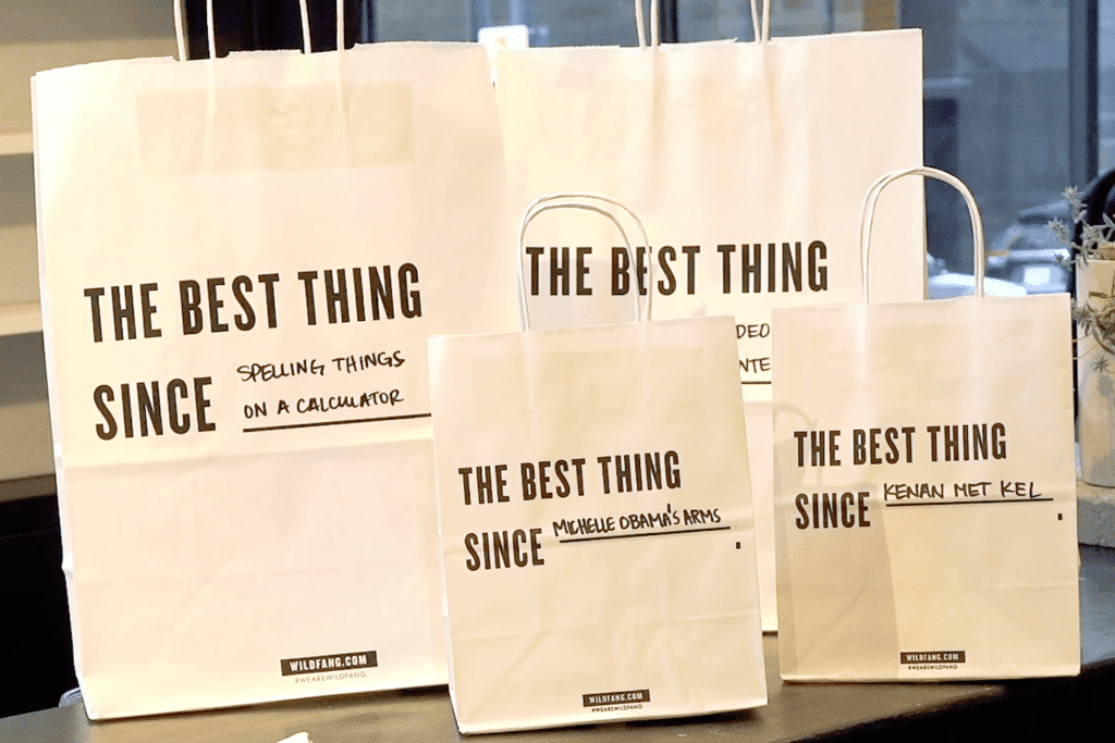
A very important part of Wildfang’s store design is “shareable moments.” They fill their store with fun experiences that are highly shareable on social media. From their ever-changing and topical marquee sign to a customized shopping bag, there is always a new message to share.
And of course, this allows Wildfang’s customers to advertise their message to other potential customers. Free social marketing!
Not just a website
Wildfang has a pretty incredible web and social media presence. The company has a strong brand with many signals, especially through their Instagram. In the video above, I took a look at some more brand signals in this area. Here’s a summary:
- Instagram: Wildfang’s Instagram presence has a very carefully crafted strategy to reach their perfect person. They prominently feature people and messages that appeal to the cheeky nature and inclusivity of their brand. And the success of their social media marketing shows, with over 150k followers!
- Online Store: They also communicate their inclusive shopping experience with their online store, which is very clean and organized. There are many different ethnicities of models shown, so that people are able to relate to anything they see. They want everyone to feel represented and included through this online experience. I also really like their “Bestsellers” tab. People are always interested in what other people are buying, and it is a great form of social proof.
- Email Marketing: Wildfang has an excellent email marketing campaign. The email I received from Wildfang advertised a “mystery discount,” which means you have to click through to find out which discount you will receive. The theme was centered around International Cat Day. It was a fun, engaging way to get customers to notice, and it certainly made me remember to look out for their emails in the future. The email, like the brand, was unique and spoke to unique people.
We can learn a lot from Wildfang. Whether you are an entrepreneur, in sales, or looking to find a date, you can adopt their ethos:
- Don’t try to appeal to everyone—appeal to your people.
- Know your perfect person and seek them out.
- Make it obvious who you are looking for.
Remember: If you try to appeal to everyone, you appeal to no one.
How Do Advertisements Work?
Advertisements work because they accomplish 2 important goals: engagement and persuasion. The most successful advertisements accomplish this by using emotional appeals that sway opinions. This influences behavior, and it often works unconsciously. For example, if we see a model wearing a red dress, we might later decide to buy one if we see it in the store.
In a nutshell, the best advertisements utilize psychology and nonverbal cues for maximum engagement and persuasion.
Which tips in this article are your favorites? Let me know in the comments below!
Side Note: As much as possible we tried to use academic research or expert opinion for this master body language guide. Occasionally, when we could not find research we include anecdotes that are helpful. As more research comes out on nonverbal behavior we will be sure to add it!
This article is part of our body language guide. Click here for more.
Article sources
- https://www.tandfonline.com/doi/abs/10.1080/01449290500330448#.U0WP9K1dVQ8%20

- https://lunio.ai/blog/strategy/how-many-ads-do-we-see-a-day/
- https://www.fastcompany.com/3027699/how-our-brains-decide-what-we-share-online
- https://www.amazon.com/Nonverbal-Communication-Human-Interaction-Knapp/dp/1133311598
- https://www.researchgate.net/publication/37689381_Campaigning_for_Hearts_and_Minds_How_Emotional_Appeals_in_Political_Ads_Work
- https://www.spirit.com/
- https://www.sethgodin.com/sg/
- https://news.mst.edu/2012/02/eye-tracking_studies_show_firs/
- https://neilpatel.com/
- https://www.surveymonkey.com/curiosity/is-it-ok-to-use-emojis-at-work-heres-what-the-data-tells-us/
- https://scholarsmine.mst.edu/masters_theses/5128/
- https://storify.com/savemymarr884/marketing-tips-the-psychology-of-color-manipulatio
- https://www.eecs.harvard.edu/~kgajos/papers/2013/reinecke13aesthetics.pdf
- https://www.theworldsworstwebsiteever.com/
- https://www.craile.com/
- https://investor.vanguard.com/corporate-portal
- https://www.tdameritrade.com/
- https://www.nytimes.com/2012/07/20/nyregion/in-new-york-city-indoor-noise-goes-unabated.html
- https://onlinelibrary.wiley.com/doi/abs/10.1111/1467-954X.00204
- https://www.audible.com/series/Harry-Potter-Audiobooks/B0182NWM9I
- https://www.acrwebsite.org/search/view-conference-proceedings.aspx?Id=7467
9 thoughts on “21 Tips on The Psychology of Advertising to Maximize Sales”
Comments are closed.
How to Deal with Difficult People at Work
Do you have a difficult boss? Colleague? Client? Learn how to transform your difficult relationship.
I’ll show you my science-based approach to building a strong, productive relationship with even the most difficult people.
Thank you for this fantastic article! Saw/heard you speak last night here in PDX at OMSI Science Pub and loved every minute of it. I also study people through their hands (a little different, though it also include gestures) and everything correlates so very nicely!
Very much appreciate this article on body language and advertising. Some of it I’ve known about from looking around myself (particularly color…and I’ve learned the hard way NOT to ask friends, colleagues, family their opinions about what I do with my website and instead “test” via visitor response—I even try not to use my own “logic” too much because I’d nix what my own gut tells me to do and what observation of my own behavior patterns tells me oh-so-clearly).
The rest I shall scurry to implement!
Thank you, thank you, thank you!
Thanks so much Ronelle! I am glad you enjoyed it… Please let me know what you implement and how it goes!
Best,
V
I was using this for research when was this article written
Wow! I never imagined that we can non-verbally influence people just by directing our own eyes, like Seth Godin image above. Now I will understand a little bit better on what the marketers are trying to do.
This information is so cool! Especially learning about products that are ready to eat being oriented towards dominantly right-handed eaters
I really liked the information about the eyes. The post makes me understand why some advertisements fail, while others are successful.
Showing people where to look and using eyes as cues are so prominent! Even Vanessa’s little “subscribe now” ad that popped up on the right on this page have her looking down and pointing to the area where you put in your info to subscribe! It’s so applicable, and now that I realize it, it’s EVERYWHERE! Ads really are more powerful than I thought.
I wonder if most people who create these campaigns know these things only intuitively or know the reason as well?
Wow this is so awesome! It is very eye opening to see how advertising works.