Startups need funding, and investors need to know about great startups.
Luckily, there’s the pitch deck.
Pitch decks are a crucial tool for startups to get the recognition they need and potential funding.
The right pitch deck can make or break a company’s future.
In this article, I’m going to show you the best pitch decks from successful companies like YouTube and Airbnb.
Let’s get started!
What is a Pitch Deck?
A pitch deck, also known as a slide deck or startup deck, is a presentation that gives an overview of a business’s plan. Pitch decks are usually created using PowerPoint, Keynote, or Prezi, and cover key points such as the products or services offered, costs, and overall business model.
Why is a Pitch Deck Important?
Pitch decks accomplish 3 things:
- they help people UNDERSTAND a business
- they get people to CARE about a business, and most importantly…
- they get people to take ACTION
Unlike what some people think, the main purpose of a pitch deck (especially in the seed stage) usually isn’t to raise money for the business.
Why?
Think of a pitch deck as an elevator pitch for your business. You don’t expect to be hired on the spot when you first introduce yourself, right?
A pitch deck introduces the company and generates that first “spark” of interest.
Only when potential business partners see massive growth potential can further meetings take place to discuss finance, logistics, etc.
So let’s dive into what makes a pitch deck so great:
15 Best Pitch Deck Examples (and why they’re so awesome!)
YouTube pitch deck
The famous video sharing platform shared this deck with Sequoia Capital, one of the most established VC investors. And taking a look at the presentation itself, you’ll notice there aren’t any graphics aside from the logo on the first slide.
YouTube opted for a text-only, simple approach—not even using a hint of color other than shades of black and white. It just goes to show how simplicity is king. If the content isn’t there, fancy graphics and colors can only do so much.
Key Takeaway: Don’t make your pitch deck too long or complicated. The YouTube pitch deck is only 10 slides, which is the perfect length, according to venture capitalist Guy Kawasaki. You can easily follow the 10:20:30 Rule using this pitch deck! See the tips section below for more about this golden rule.
Airbnb pitch deck
Airbnb’s pitch deck has no fluff and is visually pleasant. The slides hold enough information that further verbal explanation might be needed; however, most of the information can be taken in at a glance.
The layout of their pitch deck is also consistent—scroll through, and you’ll see that every slide has a border with the heading and slide number up top.
Plus, they’ve got a nice testimonial section that adds that snazzy social proof:
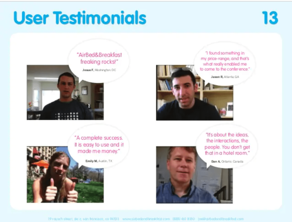
Key Takeaway: When possible, opt for minimal text and keep a consistent theme throughout your slides. Include user testimonials with pictures of real people for extra social proof.
Buffer pitch deck
Buffer, a social media software company, opens up with an important statistic: “The amount a user shares today is twice the amount they shared a year ago.” This automatically primes the audience that social media is on an uptrend and will be relevant in the future.
They also follow up with a single slide with one question:

Bam! Now that you know social media is important, how do you leverage social media to increase traffic? This is where Buffer comes in.
After presenting this pitch deck to investors, Buffer managed to land $3.5 million in funding. Not bad!
Key Takeaway: Lead with an important statistic about your business’s industry and then ask a strong, thought-provoking question.
7bridges pitch deck
7bridges is a platform that helps businesses streamline their processes. Hence, the name “bridges.”
The slide deck also stands out as having a great team slide:

Not just some overblown pictures reminiscent of online selfies. On this slide, you can clearly see the pictures of each team member, their name, their roles, and a brief description.
Key Takeaway: Clearly explain who’s on your team and the benefits they bring to the table. Avoid too little info or going overboard with qualifications.
Shopify pitch deck
Shopify’s pitch deck is rather hefty, coming in at a total of 29 slides. However, the beauty of this pitch deck is how comprehensive it is.
This pitch deck walks you through everything you need to know about Shopify, starting with the utility of Shopify, to the target market, to all the financial numbers you need to know.
Key Takeaway: Plot a storyline for your pitch deck before even starting. Imagine what questions you’d have and aim to answer them in your pitch deck.
Dropbox pitch deck
The Dropbox pitch deck starts off immediately with a picture of a messy office desk with the headline “Storage is a mess.” This is a great way to immediately capture attention with few words.

The pitch deck also avoids using full sentences and instead uses fragments. This is great to avoid overloading a pitch deck and lend power to the verbal side instead.
Key Takeaway: Lead in with a powerful image highlighting a problem and leave a powerful impression on your audience.
Wunderlist pitch deck
Is your pitch deck showing enough social proof? There’s a reason why investors care about testimonials.
And Wunderlist succeeds in demonstrating great social proof, without even having to use real people:
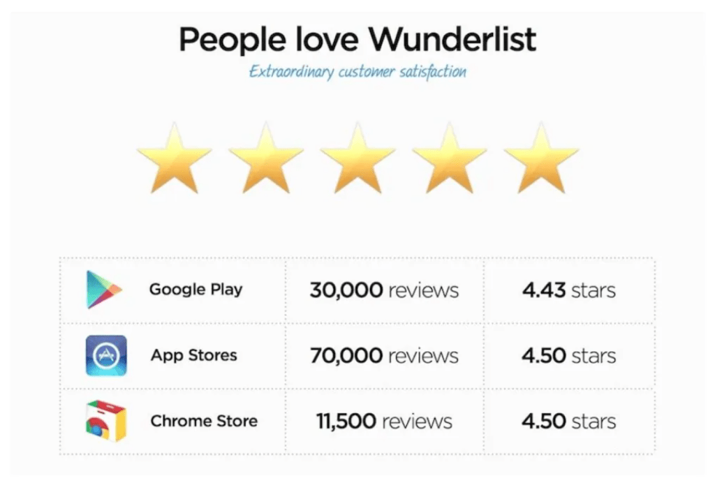
As a software-based business, they’ve been able to collect over a hundred thousand positive reviews for their product. And even though the reviews technically average closer to 4 and a half stars, they show five stars—because it looks better, so why not?
Key Takeaway: You don’t need real people to give awesome testimonials. Send out a survey online. Ask random peeps on forums. Reach out to that random guy you met in college. Get creative!
Tinder pitch deck
The Tinder pitch deck opens up with an engaging story that most of us can relate to—the fear of rejection. Putting a name and a face to the story adds an even greater impact:

As for the rest of the pitch deck? The rest is pretty bare bones since the story takes up half the pitch deck. If they could have added more, such as the team or current revenue, this pitch deck would be even better.
Key Takeaway: Lead in with a powerful story. Make it as relatable as possible and use it to highlight a major problem that your product or service is aiming to solve.
Spotify pitch deck
Take one look at Spotify’s pitch deck and you’ll know it stands out from the rest. This deck is a whopping 70 slides long, with most of the slides containing just a handful of words or a simple image.
While it’s not recommended to have a pitch deck this long, the variety in slides might be a hit if you can go through it fast enough. Plus, some of the slides are really fun and definitely need further explanation:

Key Takeaway: Aim for short slides that need explanation. Use these slides as an anchor point to bounce from and not as the main focus of the presentation.
Coinbase pitch deck
Coinbase’s simple pitch deck is information-oriented and packs in charts and data in just 11 slides. They also come in with a powerful slide that compares their product with iTunes:
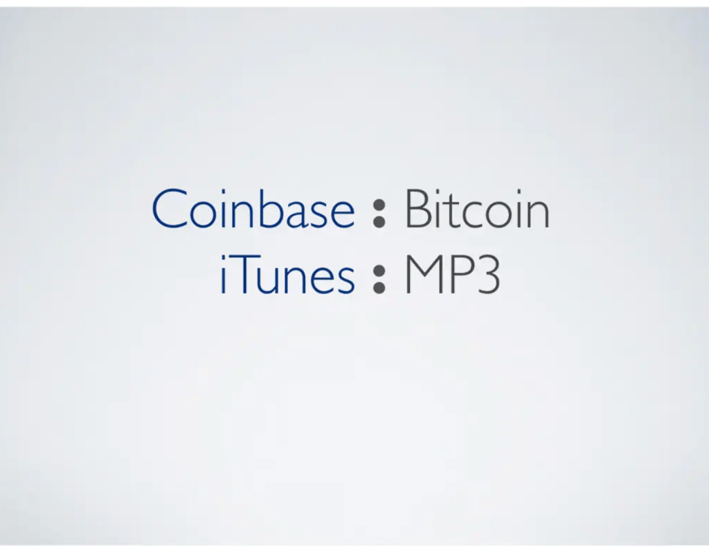
Key Takeaway: Compare your product to an already existing and successful product in the market. Is the comparison fair and not wildly overblown? Use it to your advantage.
Copper Cow Coffee
Copper Cow Coffee, a Vietnamese woman–owned company, highlights its uniqueness by starting off with a striking side-by-side photo of the CEO and her mother:

This striking difference shows just how important coffee is in her family and gives a deep-rooted founder’s story that runs through generations. (What could be more powerful than that?)
Key Takeaway: What is your uniqueness? Learn to differentiate yourself and tell a story of what drives your passion for your company.
Peloton pitch deck
How does your company differentiate from your competitors?
One reason is great, two is even better, but Peloton gives more:
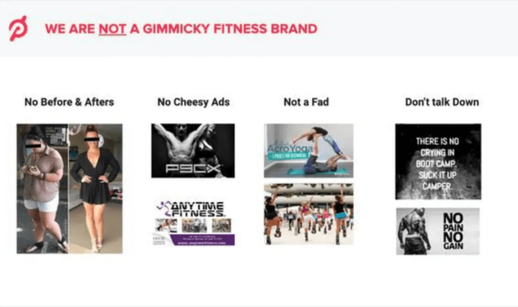
Peloton highlights its differentiating factors by shining a spotlight on popular brands that they are NOT. This gives Peloton its unique advantage point.
Key Takeaway: Can you think of popular brands that are your competitors but are also doing things differently? Highlight these differences to show your target audience is different and that your service or product may even be better!
AstroPrint pitch deck
One thing you’ll immediately notice in this pitch deck is the use of pictures. Full-screen images are common throughout this 15-slide deck, which lends itself to further explanation. (It’s also great for our visual memory!)
Key Takeaway: Try adding in full-screen images to your slides. Back up the images with your own words to make an impact and have people remembering your visuals well after you’ve finished.
Buzzfeed pitch deck
It’s clear that Buzzfeed’s pitch deck speaks volumes about them just on the second slide. They dive straight into their company’s successes:
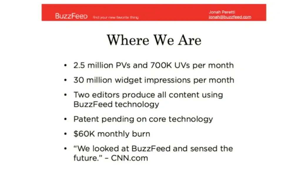
This works wonders because investors love to see a company’s performance before investing, and Buzzfeed gives it to them right away.
Key Takeaway: Don’t test the waters—dive in with the biggest impact you can make up front.
Fyre Festival pitch deck
Fyre Festival’s pitch deck has a consistent color and uses visually appealing images to attract the eye. Take a look at this slide, for example:

Even though the pictures are originally different colors, they use a black-and-color-alternating filter on the photos to attract their target customer. Nice!
Key Takeaway: What do your presentation’s colors and themes say? Are you going for the modern look to attract the younger crowd, or a more businesslike look to attract the suit-and-tie professional?
5 Bad Pitch Deck Examples to Avoid
On the opposite end of the spectrum, we’ve got pitch decks from companies that could do with a bit of tidying up. (Or even a complete makeover!)
Avoid falling for the same pitfalls as these startup pitch decks:
Moz pitch deck
Moz is a software company that provides opportunities for search engine optimization (SEO) growth. While SEO can be quite technical and needs a lot of explanation for those who aren’t specialists, Moz thought it would be a great idea to stuff as much detail into their presentation as possible.
Enter: The Moz pitch deck:
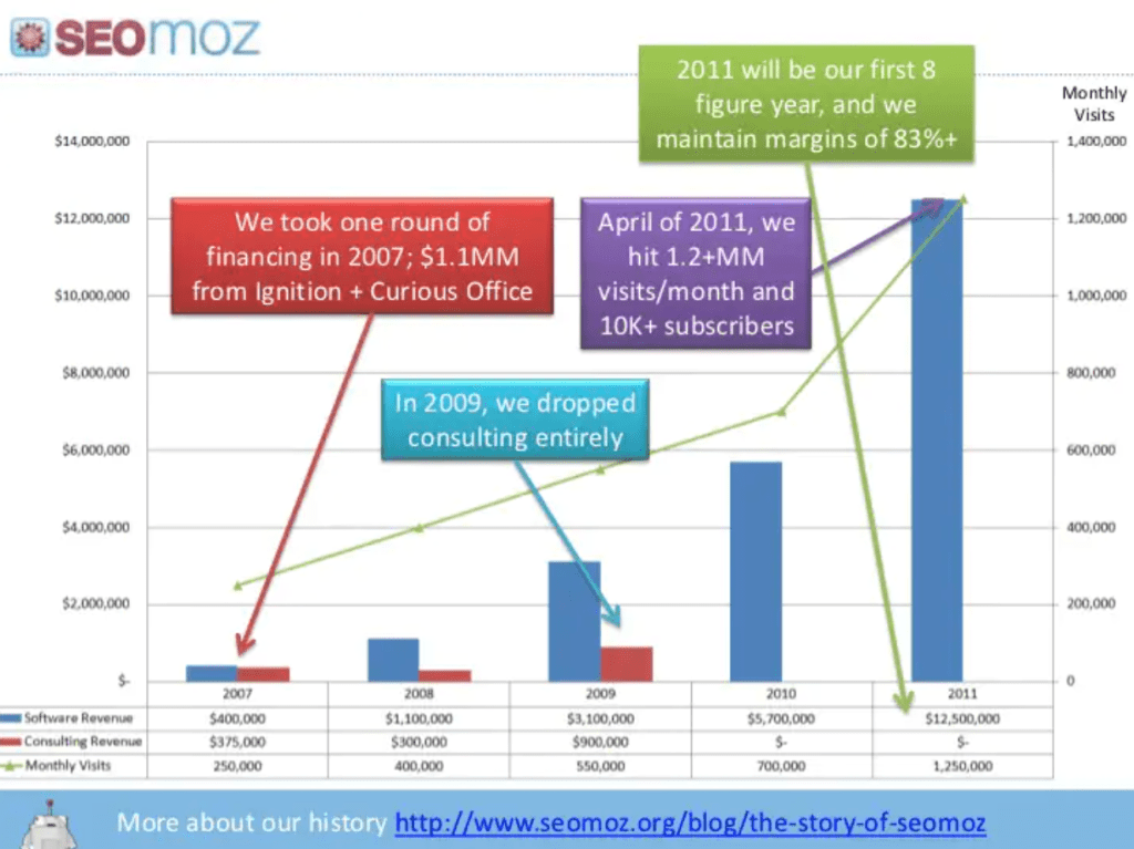
Two words: information overload.
Now if this slide makes you mentally scream, I don’t understand! then you’re not alone.
While graphs (if used sparingly) can be nice to showcase important data, the extra paragraphs and colors make the slide look like a jumbled mess.
If you’re going to have a lot of popup boxes with text in your slides, it’s probably best to tell your audience instead of bombarding them visually.
Foursquare pitch deck
Are we reading a book or a pitch deck?
Foursquare’s pitch deck starts off with a lengthy slide composed of over 100 words. That’s more words than the intro of this blog post!
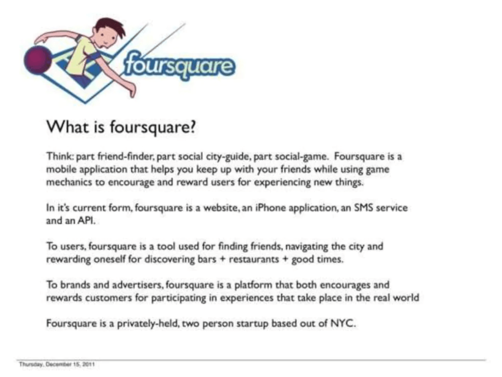
Not to mention the tiny font is an eyesore, especially for those sitting near the back. This slide looks like it firmly belongs in an information pamphlet—not in a pitch deck!
LinkedIn pitch deck
LinkedIn is great at connecting professionals together but perhaps not at designing pitch decks.
Take a look at this page:
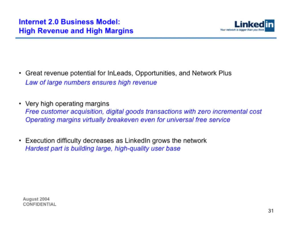
While the slide does have a suit-and-tie feel to it, breaking up the text or adding a simple graph or image could go a long way.
DocSend pitch deck
You want a pitch deck that’s easy to read, with big font and short sentences, right?
Enter the opposite: DocSend.
DocSend has a problem similar to foursquare’s—but this time, they added a graph!
Consider shortening up your blocks of text and increasing font size in your next pitch deck.
Predictive Index pitch deck
Predictive Index’s slides read more like an infographic or poster than an actual business pitch deck. While it’s pretty to look at and has an interesting theme, the lack of data can be a concern for more serious investors looking to get a return on their investment.
Key Takeaway: Keep the fun but also add in some serious stats to your deck. After all, you want to show that your product or service is actually performing and not just looking nice on the surface.
Tips to Nail Your Next Pitch Deck
Now, you’ve seen some dos and don’ts of a startup pitch deck. Let’s break it down into some more actionable tips so you can make a big impact:
Follow The 10:20:30 Rule
Guy Kawasaki’s pitch deck rule is a golden standard for creating effective pitch decks.
The 10:20:30 Rule is quite simple:
- 10 slides. You only need 10 slides for the title, problem, solution, business model, underlying magic, marketing and sales, competition, team, projections, and status/timeline. No more.
- 20 minutes. Keep in mind, something will go wrong—people will be late, the projector won’t work, etc. Aim to complete all your slides in 20 minutes.
- 30 point font. Make your font at least 30 point sizing. It’s big enough for people to see, especially if you’re presenting in a big room.
Check out more of the video here:
Evoke an Emotional Story
Have you ever watched an episode of Shark Tank? In this television show, businesses pitch investors (called sharks) and try to come to an agreement with them.
Go through enough pitches in Shark Tank, and eventually you’ll find an emotional tearjerker:
Emotional moments are the backbone of great pitches. You don’t have to shed tears or have a real I-almost-became-homeless moment, but the thing is…
Facts sell, emotions sell harder.
Take a look at your pitch deck or business. Do you have a real opportunity to evoke emotions? It could be anything from:
- An underdog backstory. Did you rise from the bottom to finally get to where you are today? Highlight the fact and why it makes you more driven/resilient/passionate than your competitors.
- Instead of giving just an example, make it REAL. Give your example a name. Make it relatable. For example, let’s say you’re running an ice cream shop. Instead of saying “X amount of people like ice cream but can’t find the perfect flavor,” say something like “Tim goes to his local ice cream shop, but every time, he seems to order vanilla.”
- Build a community. Does your product have a huge community like YouTube, Facebook, or Tinder? Highlight how amazing it is to be in this community and how real people feel about being part of it.
For more information on how to master emotions, check out this resource: The Ultimate List of Emotions and How to Control Your Emotions
Start with a Power Image
Your power image is the first image your audience will see.
Think something like:
- the Apple logo
- a picture of a woman smiling while wearing the business’s clothing
- a picture of a man at the register, with a full cart of groceries but an empty wallet
Your power image should set the tone of how you want your business to be perceived:
- fashionable
- powerful
- funny
- creative
- bold
Whatever the case, your power image should speak for itself. You likely don’t even need to add any text to this slide.
Check out more visual storytelling examples: 10 Visual Storytelling Examples to Master Your Next Pitch
Avoid Overboard Syndrome
Some slide decks fall victim to what I call Overboard Syndrome.
It’s quite simple: Think of your presentation slide deck as a wooden boat. Add in just the right amount and you might attract some potential investors.
But if you overload it, the boat sinks. Even worse—load it with all your valuable treasures (aka your proprietary secrets), then all the pirates will want to steal it!
Take command of your voice! Learn to master your voice, make it powerful, and command attention: How to Speak with Confidence and Sound Better
Optimize Your Pitch Deck Order
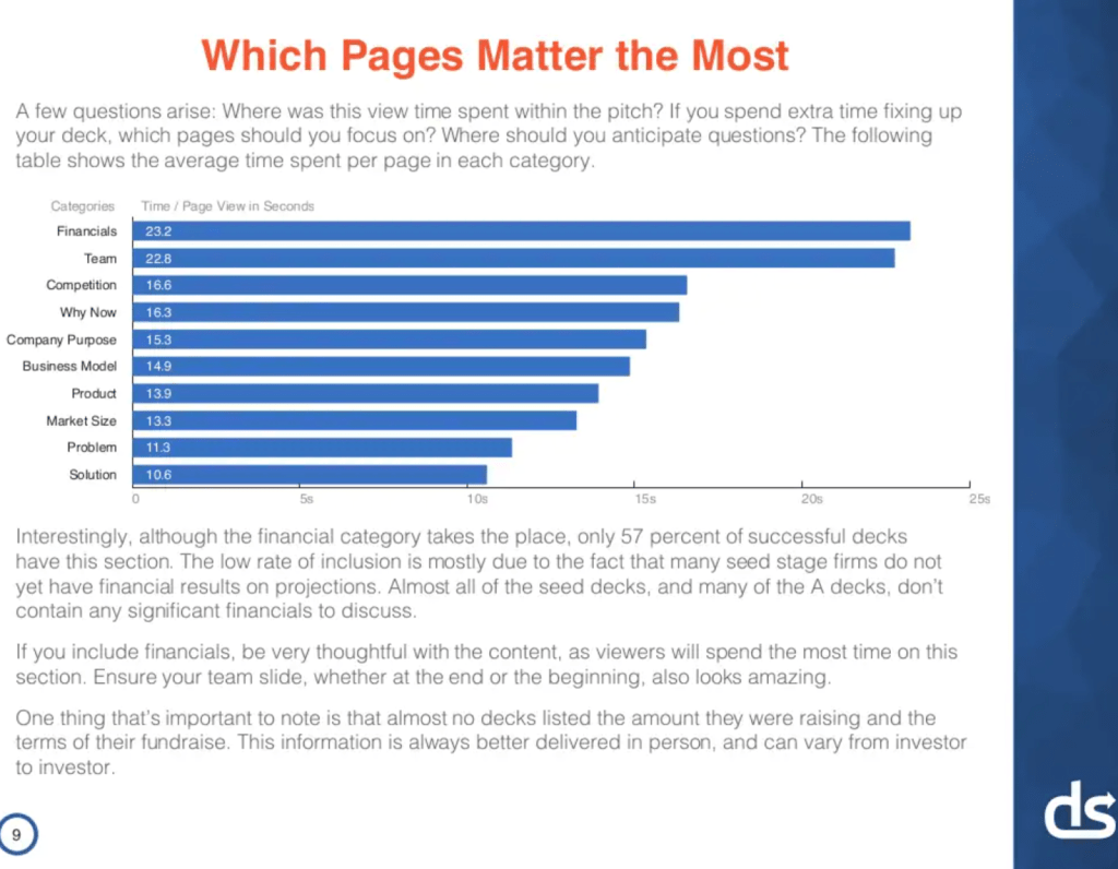
In a data-driven study by DocSend, they found the optimal order to give your slides to make the best impact.
Here’s the best order:
- Company Purpose
- Problem
- Solution
- Why Now
- Market Size
- Product
- Team
- Business Model
- Competition
- Financials
And to further dig in, you want to really focus on four main slides—the first slide, the problem slide, the team slide, and the financials.
Why?
- The first slide provides a great first impression and is your big make-or-break moment.
- The problem slide actually introduces the problem and gives a chance for potential investors to see if it’s a big deal.
- The team slide because any great product can fail without a good team (and even some mediocre products succeed just because they have a great one).
- And the financials because all investors are interested in money discussions.
Of course, this isn’t only a cookie-cutter template. You can add slides anywhere else, like a thank-you page, milestones, or testimonials.
However, sticking to these 10 points and covering all of them should be the absolute minimum for a great pitch deck.
Include a Demo
Sometimes, your product or service might not be easy to understand—especially on PowerPoint.
If you can, try to include a real-life demo of your product. Offer your investors something tangible they can try out, or at least put screenshots of your product or service in your pitch deck.
Be warned, though: Videos can be dangerous. Most slide decks do not include video, as there can be a lot of room for error—from the internet not working, to embedding issues, to even slow load times.
Learn the Small Details
Don’t only focus on your slide deck—as you can see by the YouTube pitch deck above, you can have a really bare-bones deck but make a huge impact.
Take into consideration the following:
- How much time do you have? Always leave room for error and take into consideration that others might be late.
- How is the electronic system? Do the computers hook up properly to the projector? Is the lighting going to be too distracting? Do they use Windows or Mac? Take into account these technical details before presenting.
- Are there any handouts or papers to pass around?
- How will your movement be? Will you stand behind the podium the whole time or move around freely on stage?
- Who are the most important people in the room? Do you know the potential clients or investors there? Who do you want to impress the most?
- What are the key takeaways? What do you want everyone in the room to take away from your slide? Nail these key takeaways and make sure they know it.
And of course, practice! For my first ever TED Talk, I spent months preparing in advance for my speech. And while my slides were critical for the speech, I spent much more time practicing than I did on my slides.
And it paid off! Take a look at my TED Talk here:
Have a Version 1 & 2
Alejandro Cremades, author of The Art of Startup Fundraising, says that most investors spend on average 3 minutes and 44 seconds reviewing a pitch deck.
That’s why you need a V1 and a V2.
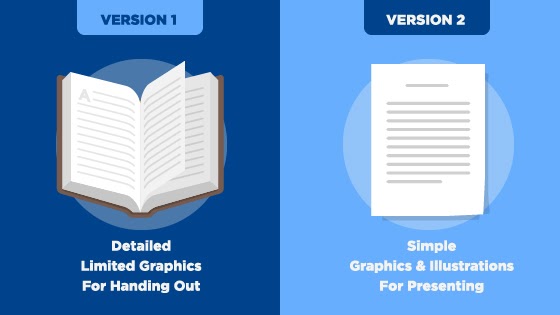
Your Version 1 pitch deck is the one that includes all the nitty-gritty details. Think of it as the final copy of the book you’re going to send out, with all the information a person needs to understand your pitch.
Your Version 2 pitch deck is the SparkNotes version—it’s the one you’ll use to present to your audience, with the fancy graphics and illustrations.
Why is the Version 1 pitch deck important? If an investor asks for a copy of the presentation, you’ll be able to give him the “full” details without having to verbally present again. Plus, you can always send out V1 after the presentation, as a follow-up to investors.
Use Concise Copy
According to a megastudy on over 1,000 slide decks, the average investor reads only 75 words per slide.
So if your slide is filled with too many words, keep your writing concise and cut down—or you risk having a slide with too much fluff. Also consider replacing straight text with images or charts supplemented by minimal text.
How long is 75 words? About as long as this tip section.
Include a Wildcard Slide
A wildcard slide can turn your pitch deck from a cookie-cutter one into one to remember. According to a study on successful pitch decks, the four types of wildcard slides are:
- The TL;DR slide. This type of slide is usually included at the beginning and highlights key information found later in the deck. The TL;DR slide was often found in above-average pitch decks.
- The Capital Efficiency slide. Want to showcase how your company’s revenue is being used and how much customer growth is being achieved with it? Include this slide in your deck.
- The “Explainer” slide. The Explainer slide is used when covering dense information, like tech infrastructure, product, and hiring plans.
- Appendix. Appendixes aren’t crucial, but they can be helpful and support your information.
You don’t have to include a wildcard, but it can offer a breath of fresh air—especially for investors used to the same pitch deck templates.
Series A, B, and C Funding: How Does it All Work?
Most startup companies seeking funding will first enter the seed funding stage, where they will try to raise the first amount of money from new investors. Common investors during the seed funding stage include the founders themselves, friends, family, and even venture capital companies.
After the seed round, if a company needs further funding, they will move onto the Series A funding stage. During this stage, a company usually has a proven track record and will ask for further funding to optimize its customer growth or products offered. The average amount raised for a company during this stage is $15.6 million.
And as you might have guessed, Series B and C funding are usually for more developed or already successful companies.
When creating a pitch deck, keep in mind the stage of funding your company is currently in. Depending on the stage, you might have to include more details and pictures (early on), but if you’re already more established, you might be able to get away with less.
Bonus: Free Pitch Deck Templates
I know you want the best pitch decks to nail your next presentation. That’s why my team and I rounded up the BEST free pitch deck templates for your every need (so you don’t have to!).
Check them out below!
- the best presentation pitch deck templates
- the best business pitch deck templates
- the best Canva pitch deck templates
- the best pitch deck templates for PowerPoint
Now that you know a little more about the best startup pitch decks, over to you: What is your favorite pitch deck so far? And do you have any pitch deck tips not listed here?
Let me know in the comments below!
