Have you ever had an upcoming presentation or PowerPoint and thought to yourself:
- “I’ll just throw some slides together.”
- “Bullet points are good enough.”
- “Eh, I’ll wing it.”
- “Let me Google some slide templates.”
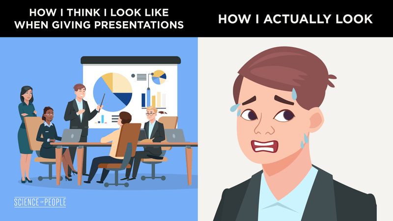
Instead, try this game-changing technique: visual storytelling.
Along with my good friend Janine Kurnoff, we’ll teach you exactly how to ace your next presentation.
Janine is the Founder & Chief Innovation Officer at The Presentation Company, a business communication firm that teaches visual storytelling techniques to big brands. She also has an amazing new book, Everyday Business Storytelling, which I highly recommend.
Check out our interview below:
What is Visual Storytelling?
Visual storytelling, or visual narrative, is the art of using visual content such as pictures, video, and diagrams to communicate an effective story. Visual storytelling can be especially useful in business PowerPoints and presentations to engage, motivate, and influence audience members more so than traditional PowerPoints without visuals.
The #1 Visual Storytelling Technique to Create Amazing Pitch Decks

Researcher Uri Hassan at Princeton University set out to answer the question: Why do we love stories so much?
To find out, he asked volunteers to listen to a 15-minute audio recording of a high school prom story. He tested the volunteers and found that those who had the best comprehension also displayed the most neural coupling, or the brain’s ability to “mirror” the speaker.
In other words, listeners were able to mentally “transport” themselves to the story being told by the speaker. So in any great pitch deck, you’ve got to tell a great story. Do not opt out of storytelling—anyone can do it.
You do NOT have to have a TED Talk to master this skill.
Even if it’s a PowerPoint for 2 people, a great story can dazzle your audience.
Here’s how to do it, using the 4-step framework of Setting, Characters, Conflict, and Resolution:
Setting
The main goal of the setting is to bring in data for your characters so everyone is keyed in on what you’re about to say. It doesn’t have to be long (shorter may even be better), and it can either be verbal or visual.
Try introducing the setting with one of the following:
- a favorite quote
- a shocking statistic
- a personal anecdote
- a power image (more on that later)
Here’s an example:
Say you’re at a sales meeting with a potential client. Your goal is to sell them on the merits of going remote, so you lead in with a shocking statistic: “Over the last 10 years, the remote workforce has grown by 91%.” This sets the stage for the importance of remote work.
Characters
Next come the characters. Characters in a pitch deck are either real stories, made-up anecdotes, or even humanized aspects of your pitch deck.
In other words, you’ve got to take facts and statistics and add a human element to them. For example, if you’re giving a weekly business update, you might want to include your target customer—how they feel about your product and what’s working or not working.
Or if you’re selling a new innovative product, find a way to relate to how others would use it and don’t focus on just the features.
In our example above, here is how we could introduce characters:
Start with a relatable character. Let’s call him Tom. Tom has been working in the office for a few years now. He’s a loyal office worker and loves his job, and he’s excited to complete his next big project, which could potentially land him a promotion.
Conflict
After the characters, you need to introduce some healthy tension. This is the mental bridge that gets people from the WHY to the HOW.
In the conflict stage, talk about your challenges, competitors, or problems. And to make an even greater impact, stick to one main idea or takeaway. This is the BIG IDEA your audience can focus on and the main focus of your pitch.
Here’s how this works in our example:
Secretly, Tom is suffering. He’s overworked, cramped in his tiny office space, rarely gets any sunlight, and not to mention his long commutes barely afford him any time with his family. Tom’s stress is building up over time—like an overpressurized barrel about to explode—and he’s about had enough.
Resolution
Lastly, you’ll want to end your presentation with the meat and potatoes—or how to solve the conflict. List out the steps and recommendations for your presentation on how to solve the problem.
Homework: Open your last slide presentation. Print it out or keep it electronic, and add boxes to each slide, mapping out these 4 parts of the framework. Can you clearly identify all 4? And are they in correct order?
If you see problems, don’t worry! Think of this like the rough draft to a great presentation. You’re naturally going to see some holes—did you start with resolution? Is your conflict not clear enough? Time to fix it up!
Here’s how this could work in our example:
To solve the problem, Company X can try implementing a 3/2 at the office/at home policy. Tom will come to the office for 3 days out of the week, spending the remaining 2 work days at home. This will ease Tom’s stress while still exposing him to his routine environment. Over time, if Tom’s productivity stays consistent or even increases, his days working at home can also increase. Tom may even transition to full-time remote working—a win-win for both the company and Tom!
I love doing this on a whiteboard or with color Post-its. Put all characters or possible characters on green Post-its and all conflicts or problems on red Post-its. This can help you move things around.
10 Visual Storytelling Tips You Must Know
Got the 4-step framework down?
Great. Now it’s time to move on to my favorite visual storytelling tips.
Start With a Power Image
So you’ve got a snazzy title screen and are ready to dive into your visual storytelling journey.
Now what?
To start off strong, I recommend using a power image. A power image is an image that creates strong emotion, gets people thinking, or uses humor. The aim is for this image to grab attention right off the bat.
Strong images make people feel first and think second.
For example, if your agenda is teamwork in the workplace, you might want to lead in with something like this:

Or, if you’re introducing a brand-new product, you might want to start off bold like Steve Jobs did with the introduction of the first iPhone:
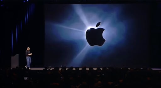
Whatever the case, your power image should speak for itself. You likely don’t even need to add any text to this slide.
Once you’ve shown your power image, you can set the scene to introduce the setting in your visual storytelling framework.
Choose the right fonts
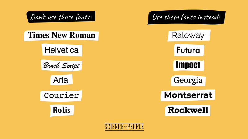
The verdict is in. In a survey on different fonts, these fonts were found to be the least favorite (based on count):
- Times New Roman (19)
- Helvetica/Helvetica Neue (18)
- Brush Script (13)
- Arial
- Courier (8)
- Rotis
- Souvenir (6)
- Grunge Fonts (generic) (5)
- Avant Garde
- Gill Sans (4)
- Comic Sans (3)
Some of these might be obvious. Times New Roman—did you forget to change fonts? This is often the default font, so we’re super bored by it! Or Brush Script—maybe you’re going overboard.
If you find yourself using one of these fonts, switch out! Try one of my favorites above, or browse this amazing font site for inspiration.
Pro Tip: Font colors are important too. If your background and font color are too similar, it’ll be difficult to read. Like this BAD example:

Don’t JUST Use PowerPoint
PowerPoint or Keynote is great—but that should just be the START. You can do so much more!
It’s 2021 (or beyond, whenever you’re reading this), and it’s about time to change. So instead of your usual PowerPoint or Keynote, why not switch it up?
- Stop screen sharing. Body language and facial cues go a long way in conveying meaning and building rapport, so why would you hide behind your slides by screen sharing? Try using a tool like Prezi Video to appear alongside your slides and visuals—it’s a great way to stay connected with your audience, or even have some fun by interacting with your on-screen content.
- Props. Try ditching slides and swapping out for props. You can even add an element of play and incorporate LEGO bricks, marbles, or candy. Add props to enhance your storytelling objective—characterize concepts by using inanimate objects like dolls or stuffed animals, bring in fruits or vegetables to use as analogies, or pass out paper handouts so your audience has something they can physically grasp.
- Music. Do you play an instrument? Have a song that tells your idea well? Try incorporating it into your pitch deck. Keep it short and simple, and keep your audience in mind—a modern techno song might not be well received by a group of seniors!
- Instructional Video. Let’s face it. If you’re trying to explain a difficult concept, there’s probably someone on YouTube who’s already done it better. Try grabbing a snippet and using that as bounce-off material. Just make sure the video doesn’t outshine the rest of your presentation.
- Get creative. Check out this amazingly creative presentation that absolutely blew away the audience at a business conference in Jordan. You don’t have to go all out, but a little creativity can stand out in a sea of boring slides.
Pro Tip: When starting out, try using pen and paper or a voice recorder to draft your story. You might find you’re even more creative when not starting with a Keynote or PowerPoint!
The Psychology of Color
Did you know that color changes how we feel?
- Blue can make us feel loyal, stable, and tranquil.
- Green can make us feel success and hope.
- Red can make us feel passionate or intense.
When choosing colors for your pitch deck, think carefully about which emotions you’re trying to represent. And it’s not only for the PowerPoint—pay close attention to what you wear.
One study had a presenter showcase a poster. During her presentations, she wore either a lavender-colored blouse, which matched the poster color, or a clashing red one. Researchers examined to see how many people tuned in to the presentation.
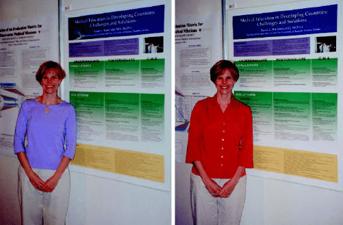
Can you tell which color blouse led to the highest number of audience members?
If you picked the outfit on the left, congrats! The presenter attracted a lot more audience members when she wore the lavender blouse. So if you want the best results, try to match your clothes to the colors of your pitch deck, and read more about the psychology of colors.
Pro Tip: Use a matching color palette in your slides. This will help keep your pitch deck looking professional and uniform. I suggest using a tool like Coolors.co to find a matching palette.
Group common visuals
What makes art so pretty?
Most of the time, there’s a common “style” to art that you can tell right off the bat. The same principle applies to the images on each slide. What kind of images are on yours?
- round vs. square
- black and white vs. color
- vintage vs. modern
- creative vs. realistic
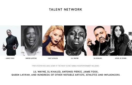
You want to make your images synergize, not clash. This means keeping like images together. Remember the Fyre Festival disaster? They were able to sell so many tickets because they made all of their marketing and branding look great. Here’s a pitch deck from Fyre Festival that uses an alternating black/white and color pattern:
Avoid Cognitive Overload
Cognitive overload is when people receive too much information all at once. This causes a brain “overload” that makes it harder to process information and learn.
We want to avoid this.
The solution is to keep slides as simple and direct as possible. When slides are simple, your audience will be able to focus on what matters, and they’ll also remember more. Here’s how to avoid cognitive overload:
- Consider including only the essential information on your PowerPoint, and discard or verbally state the secondary info.
- Break it up. Have small “break” slides (I like to add unique images or quotes) that let people mentally tune out for a moment.
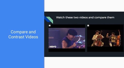
- Avoid vague titles. This one is super important. Avoid using vague slide titles like “Update” or “Video.” This literally says nothing to the audience. Instead, give a simple summary or actions you want the audience to take. For example, this PowerPoint slide gives clear directions to watch the 2 videos and compare them. It’s not titled “Videos” or “Watch this” or some other generic title.
Incorporate Text With Images
It’s pretty obvious that visual storytelling is about using images. But most people just slap an image on and call it a day.
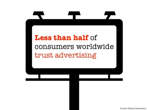
But to really rock your visuals, try blending images together with text. If you do it right, your text should neatly compliment your images. Like this one:
The 6-6 Rule
Have you ever sat through a presentation where each slide seemed to be filled with words, bullets, words, bullets, and more words?
Here’s the problem: Besides cognitive overload (above), too much text causes people to tune out. We start to read what’s on the presentation, and this grabs attention away from the speaker. People may also try to copy down all your notes during your pitch, which takes away from your spotlight.
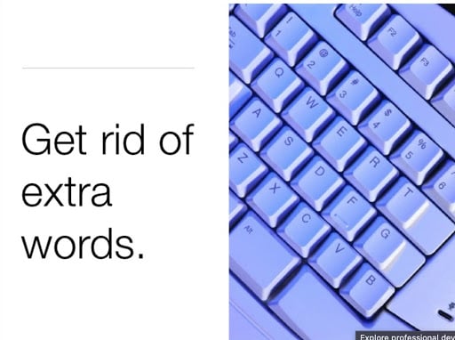
So we’re not writing a novel here. We’re here to persuade, inform, or motivate others to take action. Instead, I want you to follow the 6-6 rule:
- For every slide, use at most 6 bullet points.
- For each bullet point, use no more than 6 words.
This is a general guideline I like to follow to keep my slides looking simple and clean.
Chart Color Choices
Pie charts, graphs, line charts, oh my! There are nearly endless ways to display your visuals as charts. And if you’re pitching statistics or heavy data, you’re bound to have charts.
But how do you display them to look their best? Try CSD Charting.
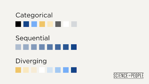
In short, CSD stands for:
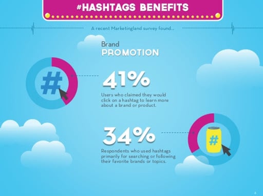
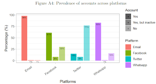
- Categorical. These charts contain obviously different categories—say, if you’re categorizing various expenses such as food, electricity, and employee cost. You’ll want to use different colors to clearly indicate different categories. For example, here’s a chart showcasing different social media platforms:
- Sequential. Sequential data uses data that matters when it comes to time, such as increases in stock prices. You can visually chart this by using one color in different saturation.
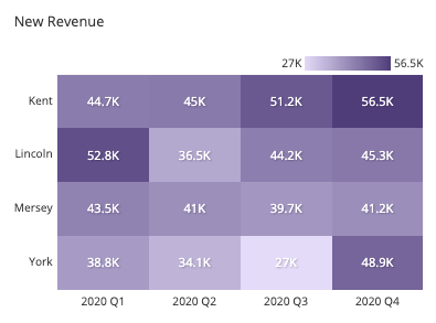
- Diverging. These charts show 2 opposites, like your stats vs. the competitor’s, warm or cold, etc. Here’s an example on percentages and ad spend:

Pro Tip: Want some more useful chart info? Head on over to HubSpot’s data visualization mistakes article to master your charts.
Picture Superiority Effect
Humans rely on a phenomenon called the picture superiority effect. This means that we remember pictures and images more than words.
Even older adults who were presented objects to remember as either pictures or words remembered the pictures more.
Here’s an advanced tip for you: try cutting out most of your words. If you can, display just one or two images per slide, with a few words sprinkled in. Some of the best presentations I’ve seen had pitch decks that contained very few words.
Bonus: Avoid These 2 Big Visual Storytelling Mistakes
The Frankendeck
Have you ever struggled to finish a presentation and ended up with a “Frankendeck”?
A Frankendeck is a pitch deck with no clear call to action. Maybe it’s missing key details and facts. Or maybe it’s 4 decks cobbled together into one. Frankendecks leave the audience confused or unmotivated.
If you’ve ever made a really bad Frankendeck, then it’s most likely because you’ve been rushed. Or you thought you could memorize all the info and magical words would just sputter out of your mouth.
Can you relate?
Reality Check: You’re probably not a professional TED speaker. And even the best TED speakers spend countless hours prepping and practicing for their big speech (I know I did!).
I like to use the rule of 10 when presenting—take how long you expect your presentation to last, and allocate 10x the time for prepping (and maybe even more for practice). So, if your presentation is expected to go for an hour, dedicate 10 hours to creating the presentation from scratch.
This way, you’re not rushed. And instead of a Frankendeck, you’ll get a clean, professional one with good planning. Which leads me to the next big mistake…
Lack of Strategy
When most people create a pitch deck, their first thought is to create the visuals first. They want a great-looking presentation with stunning visuals and artwork that stuns their audience.
But this doesn’t work. To create a great pitch deck, the story must come first, followed by the visuals. Why?
In any pitch deck, visuals are the background dancer. The story is the lead singer.
Visuals are only there to enhance the main story. When people create pitch decks without a clear narrative, they often go overboard and create unnecessary visuals. This can lead to excessive images or images that don’t really add value.
So try outlining your story first. Get rid of the impulse to create beautiful images or scan Google for inspiration. Start with the narrative—and once that’s done, you can then begin to add images to compliment your story.
And now that you’re a visual storytelling pro…
Here are some more tips to really skyrocket your presentation game:

Everything you share has just so much incredible value and links to other articles, etc. that ALSO have so much value. Yours are one of the few weekly emails I get from all the things I have subscribed to over time that I ACTUALLY read every time because the value is so great! Thank you!
Everything you share has just so much incredible value and links to other articles, etc. that ALSO have so much value. Yours are one of the few weekly emails I get from all the things I have subscribed to over time that I ACTUALLY read every time because the value is so great! Thank you!
Everything you share has just so much incredible value and links to other articles, etc. that ALSO have so much value. Yours are one of the few weekly emails I get from all the things I have subscribed to over time that I ACTUALLY read every time because the value is so great! Thank you!
So kind of you to give this away for free. Very grateful, I have used already in the suggested homework way you spoke of. Ngā mihi ( that’s Māori language for thank you and congratulations 🙂
So kind of you to give this away for free. Very grateful, I have used already in the suggested homework way you spoke of. Ngā mihi ( that’s Māori language for thank you and congratulations 🙂
So kind of you to give this away for free. Very grateful, I have used already in the suggested homework way you spoke of. Ngā mihi ( that’s Māori language for thank you and congratulations 🙂