Writing a book is hard, fun work. Picking the cover might be even harder (and funner…not a word, I know).
When thinking about a book cover, you are often faced with a number of impossible questions like:
- What’s better–a face or a cool object?
- How do you encapsulate 220 pages in one image?
- What font is most captivating?
- What color is most snappy?
When my publishing team at Penguin Random House and I began the book cover discussions for Captivate, I never thought it would be so tough–and interesting! Our process was long, fun and a bit stressful, but mostly I thought that it would be nice to shine some light behind what goes into that coveted cover.
Here’s how picking a cover works for most books–my book Captivate is business non-fiction and I’m lucky enough to be with a great publisher, so my experience is relevant to that.
Concept Brainstorm
This is when you think about the book’s first impression. How do you sum up an entire book in one page? What do you want your book’s first shelf impression to be? You grapple with all of the big choices like:
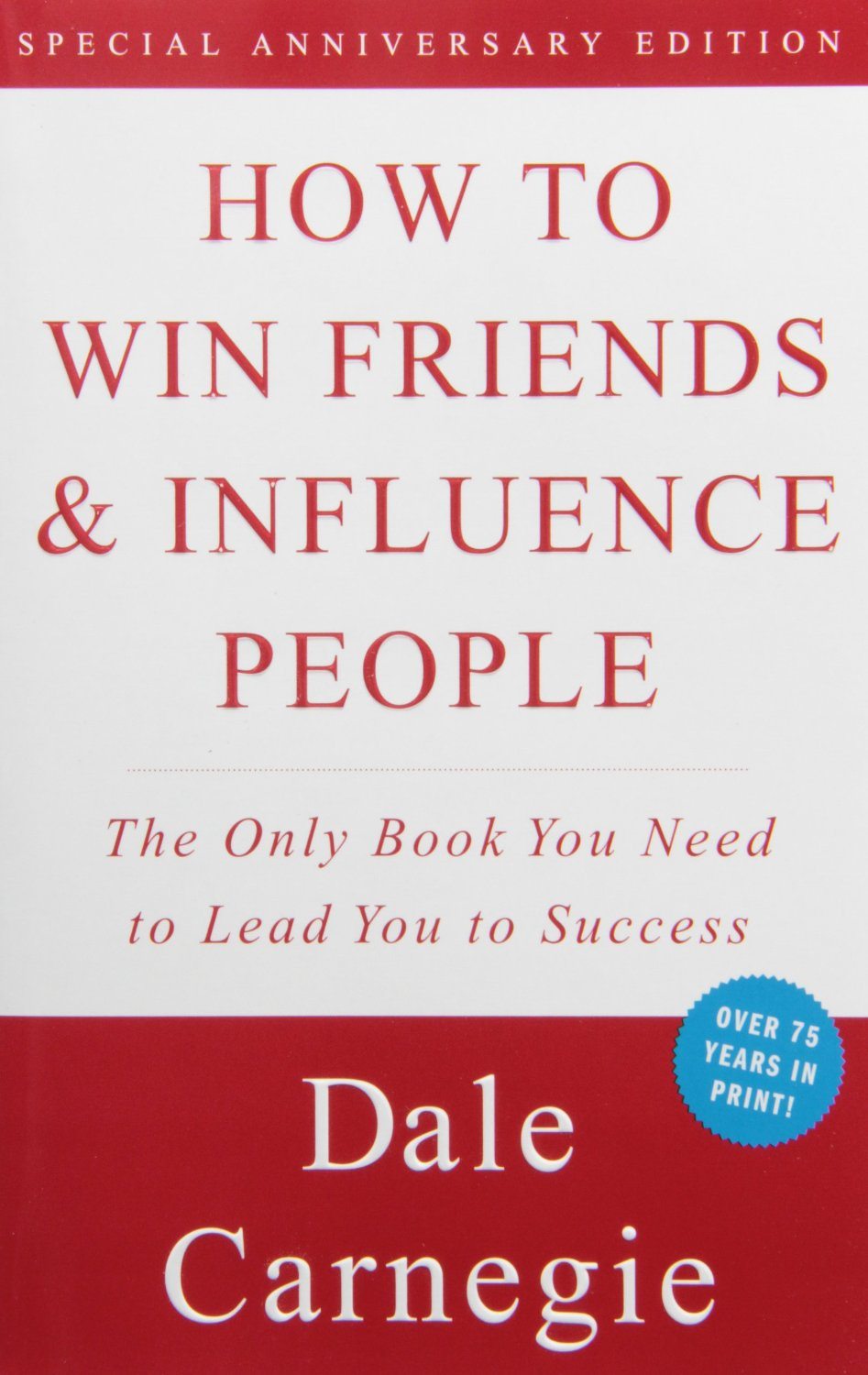
Do you use just words–no images? Like How to Win Friends and Influence People by Dale Carnegie.
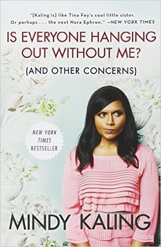
Should you have an image of a face? Should it be the author’s or a model? Full body or just headshot? Like Mindy Kaling’s Is Everybody Hanging out Without Me?
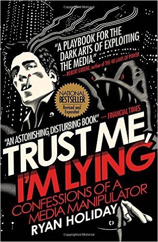
Should you have artwork? Landscape or something abstract? Like Ryan Holiday’s cool graphic cover for Trust Me I’m Lying.
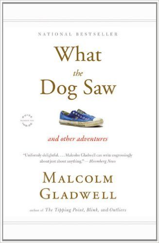
If it is an object–which one and should it be on a white background? Like most of Malcolm Gladwell’s books.
You have to either go for gripping–interesting and visually stimulating or explanatory–people get what the book is about…or both if you can.
For Captivate:
Of course, we tried to get it all. This involved lots of back and forth emails.
- A Face: I know based on my research on faces that people love to see a face–we like to make eye contact even with a photo and our brain is geared towards seeing faces. This is why people see faces in toast, bananas and clouds all the time. Our brain loves 2 eyes, a nose and a mouth.
- Branding: I wrote this book for my readers. Sure, I’d love to get new people, but I wanted my tribe to recognize me instantly. Plus, I am a free model–we could take as many pictures of me as we wanted plus the ones I already had from previous shoots.
- Explanation: Captivate is about human behavior hacking. It’s about looking for clues and finding patterns. It’s also about seeing beyond the surface to really understand people. So I came up with concept #1:
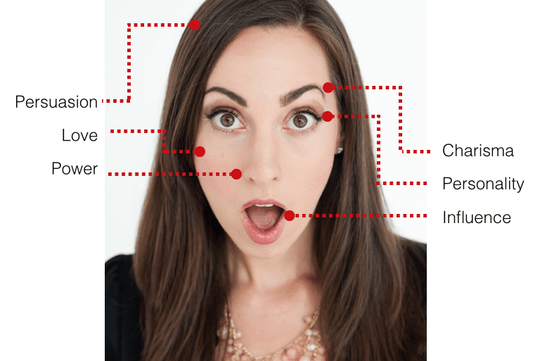
Total placeholder image, but I thought it could be cool to have call-outs and a really arresting image that would get non-Science of People followers to pick up the book. I also chose a surprise face–like “Surprise! I am so captivated.”
Book-ify
After an initial concept it’s time to make it look more like a book–in shape, size and font. But also making sure to get the title, subtitle and author name just right. This is also when we began experimenting with colors. So I sent this screenshot of something I mocked up in a slide and sent it to my publisher. My wonderful, patient, amazing editor Niki Papadapoulos liked the initial concept and the explanation above and sent it to the talented and awesome Art Director, Christopher Sergio. He then took my image and made a mock-up with the title, subtitle and my name to see how it would all fit. He had to get all of this on there easily:
Captivate
Use Science to Succeed with People
Vanessa Van Edwards
Here’s the cool image he cooked up:
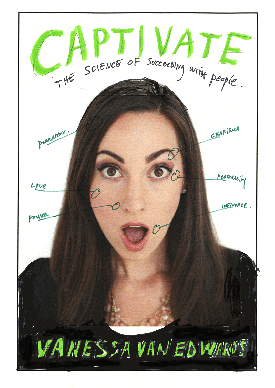
Now it’s looking a lot more like a book. We liked the general layout, so now it was time to replace the placeholder image with something better. This involved lots of back and forth emails.
Refine
My photographer extraordinaire, Maggie Kirkland of Honeysuckle Photography and my team got together in May 2016 for a big cover shoot. Here’s what we knew we wanted:
- Crisp headshot on a white background (with space above my head for the title and subtitle)
- A surprised or captivated look
- Professional attire
So we took over 991 photos trying to get it! Here is a sampling of just one page–yup we had a fan blowing fake wind and everything!
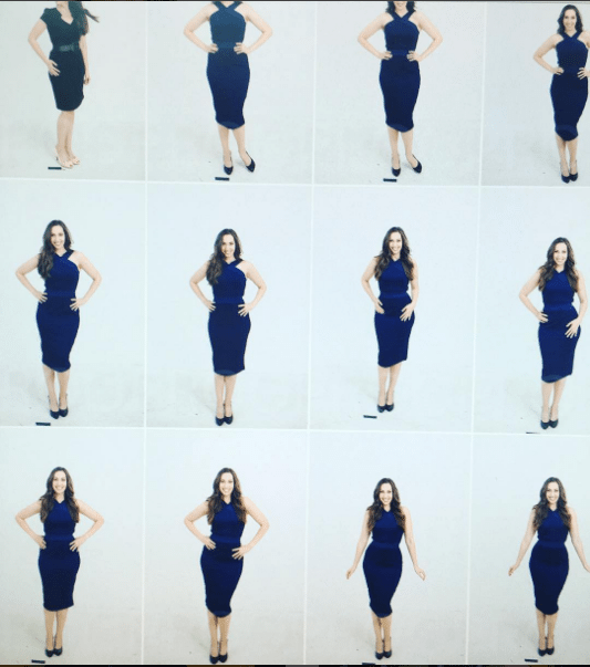
We also began to brainstorm colors and details…This involved lots of back and forth emails:
- Chris liked the white background most. In his words, “I like the white background a lot, and think that adds a wonderful cleanness to our cover. Definitely work with that. If you have time to try it more than one way, then great: also use the grey background, because grey will be the easiest one for us to turn into different colors in photoshop in post-production. (I would steer clear of the green.)”
- I also asked about clothing. He said stick to black and blue: “I like the black. That keeps the focus on you and your emotional response. Blue could also be a good option. I would steer clear of green and red for the cover wardrobe, since people have so many associations with both of those colors,” said Chris.
He also gave me these final tidbits I had not thought of:
- Solid Colors: “Whatever color you wear, it would help if it’s a SOLID, dark color once it gets to the bottom of your necklace… Because that will ensure that the author type is highly legible. For instance, looking at our sketch, if you had on an open black jacket with a white shirt underneath we would have a darn hard time laying readable author type over that, due to the high contrast between shirt and jacket. (Would we use white type or black? Neither would really work across the full width of the photo.)
- …Oh, and we definitely want neckline showing (as in the photo of you in the sketch) to help visually ground you and add some friendliness. Floating heads are weirdddd… so no black turtlenecks!! :)”
Step #4: Social Proof
We had tons and tons of photos to choose from. We even played around with images of me that looked like I was whispering something secret. Like:

But we thought that my hands would be too confusing and block the words. So we stuck with the original idea and Christopher put together real proofs for the cover with graphics. Here is what we had for option #4:
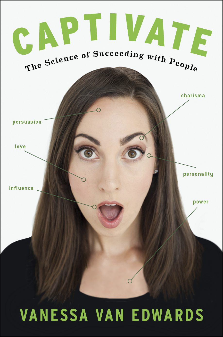
Now it was time to get out of the echo chamber and ask for some feedback. We sent it around to people we trusted and asked their opinions. This involved lots of back and forth emails. Here is some of the feedback:
- The idea is really cool, I would pick up this book.
- The little circles at the end of each line look like we are pointing out a pimple. (Yikes!)
- I don’t understand the words that well…what do they mean?
- It’s a very intriguing image…but having a woman with her mouth open on a cover could be a bad idea?
We had to really think about the open mouth thing. Was it begging to be drawn on? I made the decision to change it just in case.
Step #5: Pivot
Here was the big question:
What does being ‘captivated’ look like?
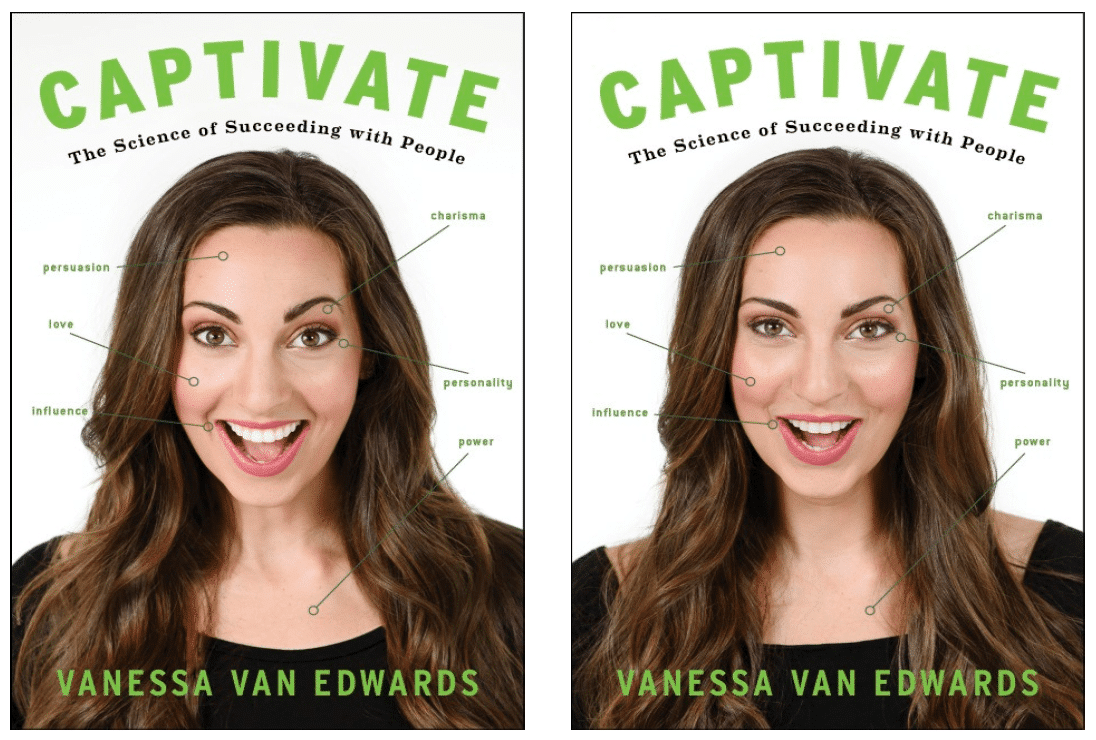
When I think of being captivated I am surprised, but I am also delighted. The original cover above is just the actual surprise micorexpression. We thought it needed to be a little more positive and use the real microexpression science. After lots of back and forth emails we decided:
Surprise Microexpression + Happiness Microexpression = Captivate
We went back to our photos and found a bunch that combined both microexpressions. So we swapped them in for this one (forgive us we had to use proof images which are a little blurry).
Data Check
Ok, so we had all of these options including the original option. The team at Penguin Random House was split, my husband and I disagreed and my team had different favorites. What to do? First, we had lots of back and forth emails. Then, thank goodness Penguin Random House and the Portfolio imprint is amazing and they said, “Let’s bring in data!”
Now, you know that I am a total data geek so I was super relieved when I found out this was an option and that Portfolio was willing to put resources behind it –you guys ROCK!!! Jill Greto is their Consumer Analytics Guru and ran our cover test. Here is what she did:
- We got feedback for our top three cover options from 1,483 respondents.
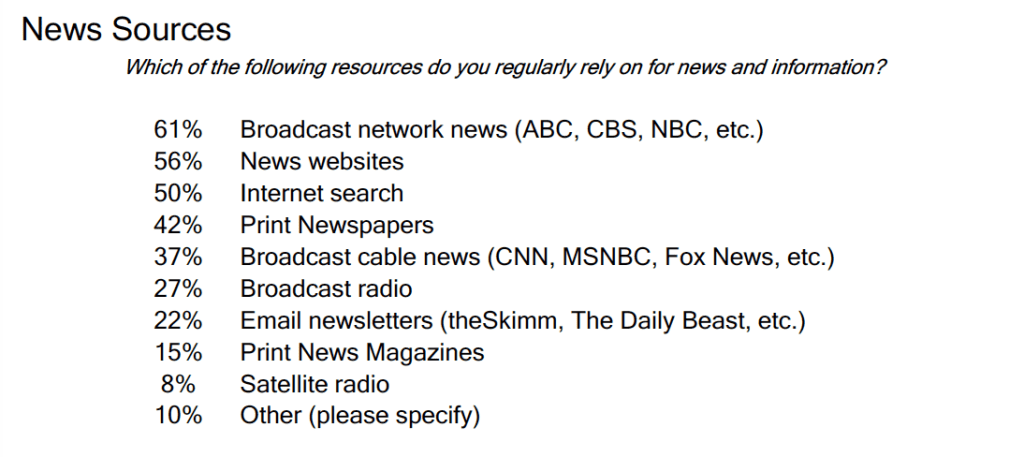
- Respondents were asked what kind of books they read (to make sure they were our ideal demographic) and basic info like gender, education level, marital status and location. They were even asked if they were an introvert of extrovert and what news sources they read. Interestingly:

3. They were asked to look at the cover and then answer a number of questions like:
- How likely are you to pick up this book and look inside?
- How likely are you to go online and learn more about this book?
- How likely are you to buy it for you?
- How likely are you to buy it for a friend or family member?
4. In the end we got a winner…and a loser. The traditional ‘Surprise Microexpression’ did the worst—only 23% found it appealing! Whereas Cover #2 ‘Surprised and Delighted’ did best with 67% citing it as their favorite and 75% finding it appealing.
Gut Check
The data was fascinating, but also I wasn’t convinced with the winner. All of the covers had low “Buy for Self” Data. Check it out:
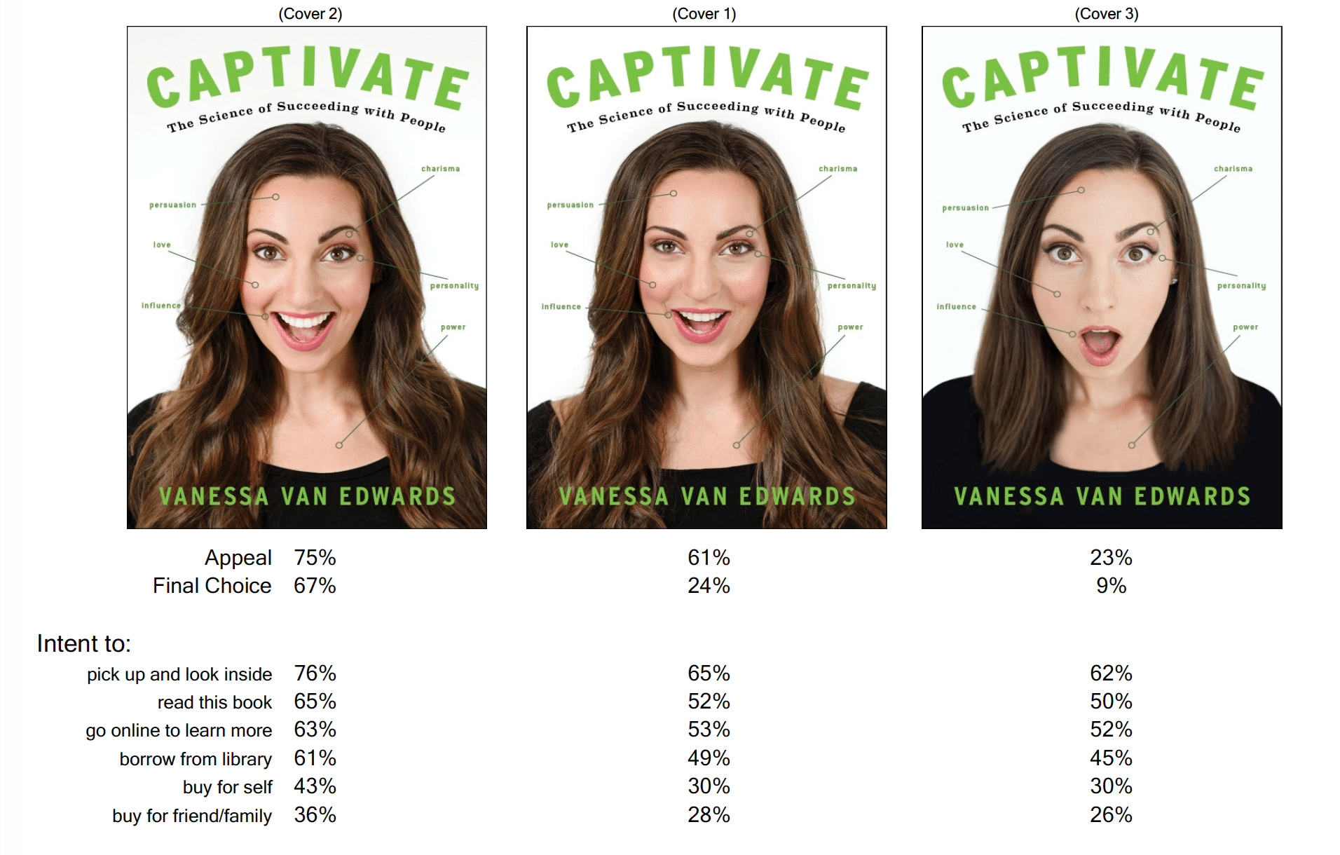
Cover #2 only had 43% of people interested in ‘buying for self’ and the others had 30%. Let’s be real, if only 43% of people would buy this in an imaginary setting, it would be WAY lower in real life. A bit of good news here is that while only 43% of all readers were interested in ‘buying for self’, the numbers were higher for our target demographic, people who read personal and professional self-help (59-60%). With these findings, I knew that the cover wasn’t quite right. I wanted way higher numbers.
I looked at the cover that got the highest rating and…something just wasn’t right. It fit all the things we thought we wanted, but for some reason is wasn’t working for me. The purchase intent wasn’t high enough and mostly something wasn’t working.
I had a really hard time at this stage because I thought this cover should be good. But something wasn’t right. And I know from previous books…you really must love your cover. It is important for the readers AND the author. It just has to emotionally grab you. And it wasn’t doing it. We then had lots of back and forth emails.
I realized that this formula:
Surprise Microexpression + Happiness Microexpression = Captivate
was good for a silly, fun book, but not a serious business book.
Pivot Again
I still liked the idea of a face and call-outs but wanted something more serious. Perhaps an intriguing kind of captivate? I went back to our photos and found one. Yes ONE photo that would have worked for a serious captivated (without an open mouth). I mocked this up:
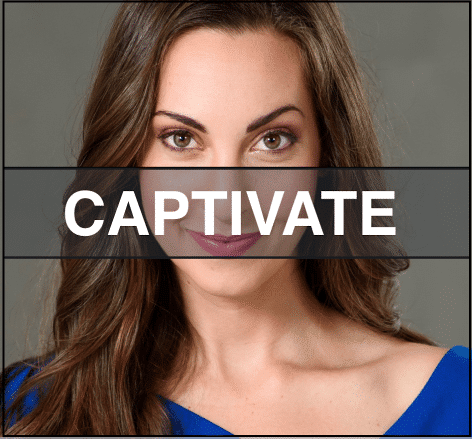
This felt closer and the publishing team liked it too. Of course, we had a lot of back and forth emails. The ever patient, ever wonderful Christopher did a new mock-up:
This felt A LOT closer. Again, we sent it around to our trusted team and got this feedback:
- I like this one a lot better! It reminds me of something more interesting.
- The blue is stronger than the green.
- The callouts are better without the circles, but can we move that one from her pupil? It looks weird.
- The dress is cool!
- The callouts still don’t make sense to me.
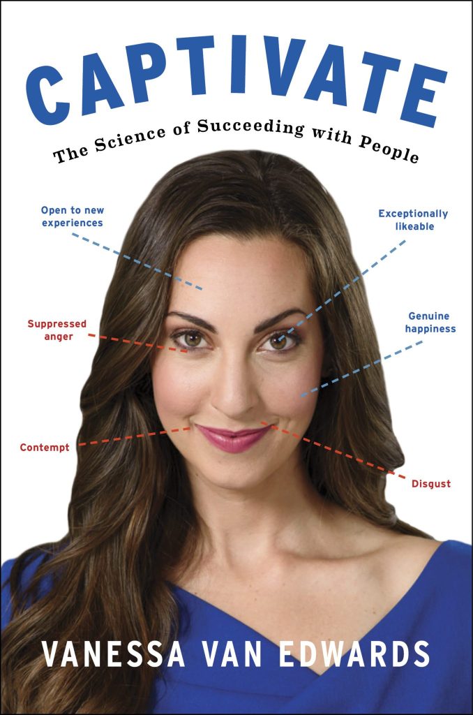
Tweaks
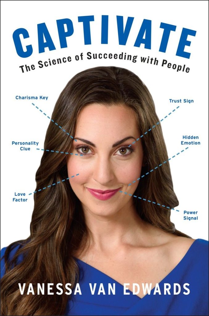
We knew we had hit on something close, but had to make some tweaks to make it awesome. Of course, this involved lots of back and forth emails. First, I changed the cues and made them more purposeful:
- Charisma Cue –> Eyebrow
- Hidden Emotion –> Dimple
- Power Signal –> Smile
- Personality Clue –> Under the eye or cheek
- Trust Sign –> Pupil
- Love Factor —> Under the eye or cheek
We also went with blue—hardcore. I love the psychology of color and think blue is stronger than green. I also didn’t like the red—looked too much like a kids book with all the colors. Specifically, here are what adjectives are typically associated for each color:
- Green: Healing, Success, Hope….and money in U.S. culture.
- Blue: Loyalty, Stability, Calm, Wisdom…In fact, blue has lots of power which we highlighted in this article.
- Red: Passion, Aggression, Sexuality…nope not for this business book!
I decided to stick with that killer blue dress that my stylist, Robin Allen found!
We also made the other recommended tweaks. Here is what Christopher made:
As soon as I opened this image I knew it was the one! Finally, it looked like a book – and a book I would buy.
I hope, hope, hope you agree and love it as much as I do. Is it the perfect cover? Certainly not…we decided NOT to airbrush out all of my little imperfections so I looked like a real person (I am one). But, I think it showcases what I hope the book is about:
- It’s intriguing
- It’s about spotting hidden cues
- It’s about looking deeper into people
- It’s about taking people skills more seriously, because I believe they are the key to success
In Conclusion
Here is what I learned:
- Your book cover is an incredibly important part of the book’s success
- It takes A LOT of emails to get a book right
- Transparency is fun and interesting. I hope you enjoyed reading about this process.

It was actually captivating to see how you all came up with the perfect picture and layout for the front cover.
It was actually captivating to see how you all came up with the perfect picture and layout for the front cover.
It was actually captivating to see how you all came up with the perfect picture and layout for the front cover.
It was actually captivating to see how you all came up with the perfect picture and layout for the front cover.
Very interesting. Thank you.
Although, I’d have gone with the grey background. For me, the stark white gives a slight ‘medical’ feel. Also, the grey brought out grey highlights in your hair which didn’t detract from your attractiveness but added a hint of experience = knowledge. Lastly the white detracted from the highlight on your collar bone – a subtle sexiness which had a lot of resonance with the title (if anyone is wondering, I’m a heterosexual female).
I’m 100% with the person who commented on the open mouth – they had a certain tackiness about them.
Talking openness, this sharing of the process shows an open and honest personality which would make me more likely to read your books.
In the end, a very successful cover.