An email signature is like a business card you hand someone when you’re saying goodbye—it includes your name, contact info, branding colors, and storefront location (if you have one).
Here are some things to keep in mind when making a new email signature, followed by some awesome examples of email signatures.
Why is Having an Email Signature Important?
The email signature is important as it reinforces your credibility and builds trust with the recipient—especially in a first introduction email. Your email signature includes all of the information for how to contact you, the company you work for, and your position in one spot.
“I look at the email signature as an extra chance to sparkle and delight.” – Melissa Cassera, Cassera Communications
The Best Email Signatures
The best email signature is one that is clear, easy to read, and visually impactful. You can make it visually impactful by using your branding colors and your most recent headshot.
#1 Include a headshot

Diana’s professional email signature is clear and includes a nice headshot. This helps the reader know she is a real person and starts a relationship as the email recipient has a face to put with the name.
#2 Put your headshot on the right

Most of the time, the headshot is on the left side of the email signature. This is what one typically expects. Use this to your advantage! By switching it up just a little bit and putting the headshot on the right, you can make it catch the reader’s eye a little bit more.
#3 Or the headshot can be in the center

Centering the email signature can be another way to stand out from other people!
#4 Use a Clear CTA (Call to Action)
What do you want your reader to do after they’ve read your email? Do you want them to check out your most recent blog post? Book a consultation with you? Visit your Etsy storefront?
Let them know!
If you don’t tell them clearly, they may be confused and click out of your email without doing what you want.

The photos to Linda’s properties look inviting and interesting, making the reader want to take a closer look at her real estate business.
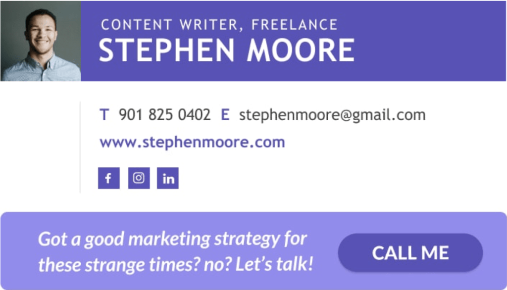
Stephen uses a dynamic CTA with a clear “Call me” button, making it simple for the email receiver to contact him.
Here are some more examples of dynamic CTAs you can use:
- Let’s hop on a call! Here’s my calendar link
- Want your kids to eat more veggies? Order my newest book, “Healthy Recipes: From One Mom to Another”
- The holidays are around the corner! Get your special someone a piece of hand-made jewelry from my Etsy store
- Let me help you with your website. Book a consultation with me here
- Check out my newest blog post on “10 Books to Read this Summer”
It looks cleanest when you hyperlink words like [here], [title], [store], but you can also include the link after the CTA.
#5 Include your brick-and-mortar address

If you have a physical location, add your address to your business email signature so people know where to find you. This will also save you a future email asking them for your address.
#6 A discount when you click on the link

Including a discount in your CTA can incentivise people to click on the link! Give this a try and then keep an eye on sales analytics to see if it’s helping increase the number of people buying your product or booking appointments with you.
#7 Use your logo

Jennifer’s logo is attractive and conveys peace through the color palette and organic shapes of the river and branch.
If you’ve got a logo you really like and that expresses something about your brand and your industry, go ahead and use it!
#8 Use bold and italics to direct the reader’s eye

James does a nice job of using bold and italics to differentiate aspects of the design and draw the reader’s eye.
#9 Add any needed legal disclaimers
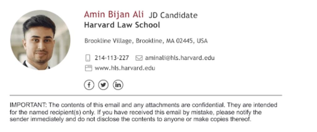
Depending on your profession, your business emails may need to include a disclaimer. Add this to your email signature to make sure you don’t accidentally forget to include it for any of the emails you send.
Creative Email Signatures
For a more creative email signature, consider adding various details like a GIF or using bold colors to help catch the reader’s eye.
#10 Dynamic design

This dynamic design catches the reader’s eye. Notice how Doe has used darker colors around the border, while the contact info has a mostly white background making it easy to read.
#11 Use design to direct the eye

Martin’s email signature uses a dark blue arrow to direct the eye to his headshot and contact information. You almost don’t even realize you’re being drawn in until you’ve read the info.
#12 Add an animated logo
Bot Clock – with an animated gif logo
An animated logo, if too complex, can become distracting to the reader. Keep it simple like this one here and it can help draw the reader’s eye to your signature without distracting from the content of your signature.
#13 Use a fun shape

By using a hexagon, Jennie has made her signature a little more spunky and creative. This is an easy way to make your email signature more memorable and show a bit more personality while still looking professional.
#14 Color coordinate your outfit
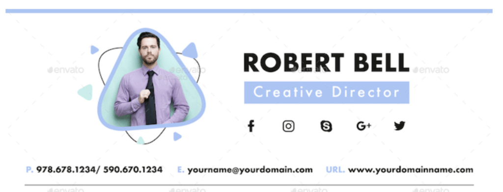
Notice how the lavender color of Robert’s shirt works nicely with the periwinkle blue used throughout the design of his email signature.
The colors complement one another, making it feel intentional. It helps elevate the design and creativity of this signature.
#15 Make it represent you

As a musician, Shelly will want to make sure people can easily get a feel for her musical style. By embedding a SoundCloud music sample, she makes it easy for the reader to listen to her without ever leaving their email inbox.
Here is SoundCloud’s guide for how to do this.
#16 Incorporate your art

Zander’s email signature includes a headshot that demonstrates his style and skill as a visual artist. This is a creative way to make it personal and impactful at the same time.
#17 A nice, handwritten sentiment
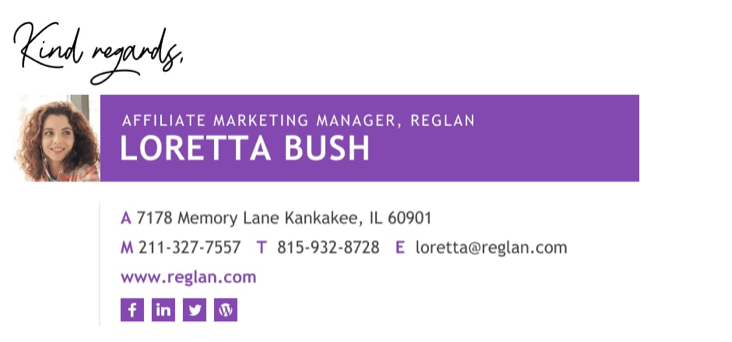
Here, Loretta has chosen to have her email sign-off, “Kind regards,” become part of the email signature design.
The one downside of this is that it limits her ability to get creative and switch up the signoff, but it does feel more personal with the hand-written look she has chosen.
Funny Email Signatures
Emails can have a pretty serious tone—especially in the professional world. Since the signature comes after the body of the email, you can use it to show more personality.
#18 Coffee and beards
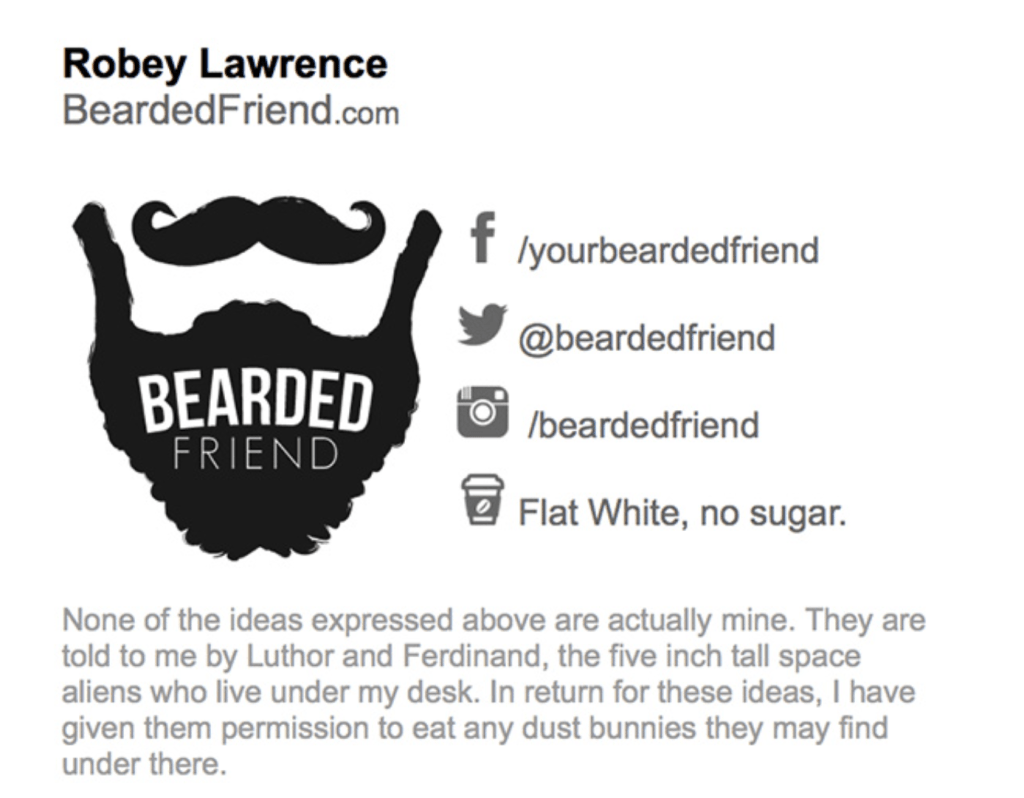
Robey here lightens up the tone by including his favorite coffee order and a stencil image of a beard.
#19 A funny “headshot”

Instead of a picture of himself, Jamie has opted for an engineering lego headshot. By doing this, he’s lightened the overall mood of the signature while keeping a visual element that catches the eye.
#20 A goofy headshot
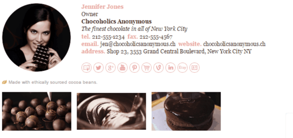
As a chocolate shop owner, Jennifer uses her email signature to show how dedicated she is to her craft. Her headshot looks like it was taken using studio lighting, giving it an intentional and professional feel, but the way she’s biting the chocolate bar is unexpected.
That element of unexpectedness catches the reader’s eye and makes one chuckle.
Cute Email Signatures
The email signature is the place to showcase a bit of your brand’s personality. Here are some ways to make it a little less serious and a little cuter.
#21 “Handwritten” signature
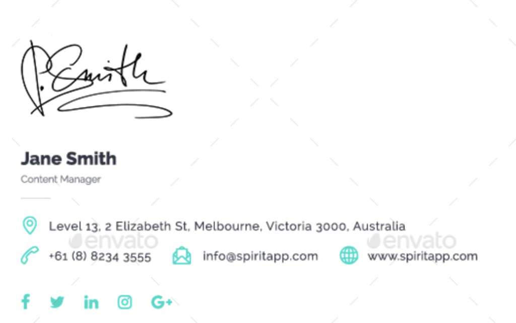
Jane has added a personal touch to her email by using her handwritten signature. By including her full name in type, she’s made it easy for the reader to know who is writing—handwritten signatures can sometimes be hard for people to read.
#22 Add a cute holiday-themed element

This bakery added a fall-themed email signature that is both cute and effective. It reminds the reader that it’s time to order their desserts for Halloween.
#23 A cute, bold print

Although this might not work for every profession, it feels quite fitting for an illustrator to have a cute, bold design element as Jorgie has done here.
It looks youthful, but the muted color palette helps it not feel chaotic despite the letters having a range of widths and proportions.
#24 Have a cute logo
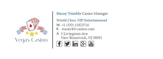
It’s best when your email signature matches your company’s branding. In this instance, the Vegas Casino card logo is playful, giving the signature a cute feel.
Email Signature Faux Pas to Avoid
Here are a few examples of what to avoid when making an email signature. These are things that distract from the main goal of the email signature, which is to clearly share with the reader how to contact you and where they can see your work.
#25 All the social media icons

Peter has included every social media account imaginable. Even if he is Spider Man, it’s hard to imagine he’d have the time to maintain all of them to a level that accurately reflects his professional work.
If you’re finding yourself tempted to include everything from Myspace to TikTok, consider which platforms are a good professional look at who you are. Facebook, Twitter, and LinkedIn are platforms that are commonly associated with people sharing professional achievements, but choose the ones that work for you!
Also, be conscious not to include too many website URLs, phone numbers, and email addresses. It can make it confusing for your reader to know which methods of communication to use.
What to do instead: If you’re tempted to include every possible way of contacting you, stop and ask yourself what method of communication you’re most likely to see and respond to.
For example, you may have both a personal phone and a work phone. If the email is work-related, include your work phone! On the other hand, if you’re emailing to gain traction for your side-gig, it might be better to include your personal number.
The same concept applies to linked social media icons, email addresses, and website URLs. Pick and choose the ones that communicate a cohesive story about the work you’re doing.
#26 A hard-to-read font

Elis has chosen a font that is not the easiest to read, which isn’t great for accomplishing the goal of making it easy for people to contact him.
What to do instead: Use a classic font like Times New Roman, Arial, or Helvetica to make sure it’s easy to read.
#27 An unrelated image
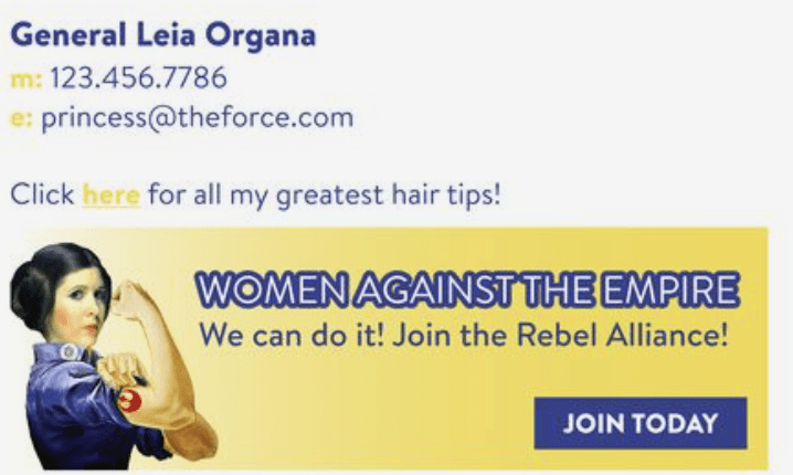
Especially in professional settings, it’s typically best to keep everything very cohesive. In this instance, it takes the reader a while to realize that the email sender is offering hair tips. The Star Wars reference detracts from the overall function of the email signature.
What to do instead: You can choose a fun image! However, do your best to find something that aligns with your business.
A logo or a headshot are typically good options for images to include that will draw the reader in while being cohesive with your branding.
#28 Having a signature that only works on one type of device
There are so many different ways to access email, and it’s one of those to-do list items that people will sometimes take care of from their mobile device while on-the-go or from their laptop while at the office.
If you create your signature on a laptop, there’s a chance the formatting will look wonky on a phone screen.
What to do instead: Make sure your email signature shines no matter what type of device the reader is using.
When you finish creating your signature, send yourself an email. Open this email on all the devices you have access to—computer, phone, and/or tablet—to make sure it looks good on all of them.
It may also be a good idea to test what the email signature looks like on various email platforms. Consider asking a few friends what email provider they use and sending a test email to someone who uses G Suite, Microsoft Outlook, AOL, Hotmail, and any others you have the chance to test.
Email Signature Bonus Tip: Write an Engaging Sign-off
When you’re writing an email, so much thought and consideration go into the body of the correspondence. It can be easy to end an email without much thought.
But don’t do that! Your reader might start to skim and not notice your email signature.
What to do instead: Here is a list of 51 Email Sign-offs you can use for all your email writing needs.
The “Dos and Don’ts” of Email Signatures
Creating an email signature is a helpful way to let someone know how to contact you, increase your credibility, and show a bit of personality.
However, it can be difficult to know how to go about it for the best results.
Here are some “Don’ts” of email signatures:
- Don’t clutter it with too much information
- Don’t use every color imaginable—it can distract from the content of what you’re saying
- Don’t forget to check what the email signature design looks like on various types of devices
- Don’t miss the opportunity to direct people to watch your most recent video, read a blog post, or book an appointment with you
- Don’t have a boring email signature that people will glance past without noticing
- Don’t use a font that’s hard to read
Instead, here are some “DOs” of email signatures to help yours stand out and increase the chance someone will respond to you:
- Include the needed contact info—it’s good to have your name, job title and company name, email, LinkedIn, and relevant social media links
- Make it cohesive with your branding by using the same colors and showcasing your logo
- Once you’ve finished designing it, send yourself an email and check to see how it looks on various devices
- Remember to add a CTA
- Add your headshot—this will help catch the reader’s eye and draw them in to read the other information
- Choose a font that will be easy for the reader, some good options are Times New Roman, Arial, or Helvetica
Make sure your email starts as strong as it ends. Read these 55 Email Greetings to keep your emails fresh, fun, and professional.
